33 Neutral Home Decor Ideas for a Calm and Cozy Home
Neutral home decor ideas tend to surface at the exact moment a house stops feeling restful. Toys, mail, and half-folded laundry pile up fast, and bright colors or busy patterns only add to the visual noise.
A calm room does not happen by accident. It comes from a handful of deliberate choices about texture, tone, and what you actually let take up space. That is the real promise behind a neutral palette: not a house that looks unfinished, but one that finally feels settled.
This guide walks through 33 real rooms, each built around a different way softness, natural materials, and quiet furniture choices come together to lower a space’s temperature. Some ideas are as simple as swapping a single throw pillow. Others rethink an entire wall.
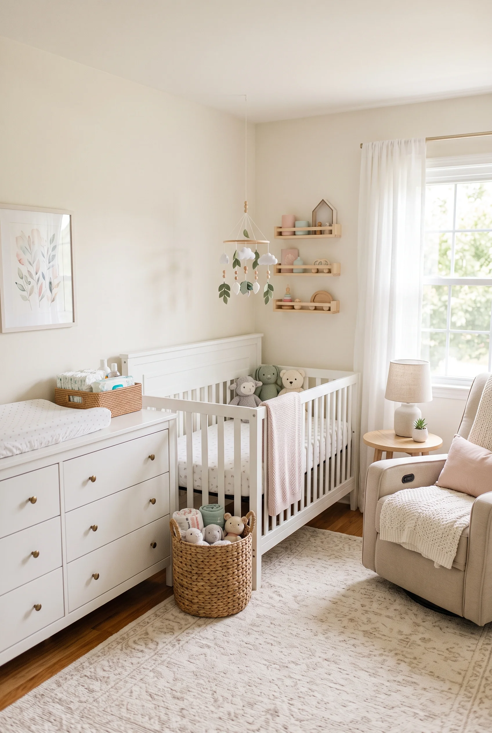
If you have already leaned into this look in a nursery, the instincts carry over easily, and our neutral nursery color palette guide is a useful companion for that overlap. What follows is organized around seven design principles rather than a random list, so you can jump to whichever one is standing between your current room and the one you actually want to come home to. A calm room is never really finished. It just keeps giving you room to breathe.
DISCLOSURE: Some of the links provided on this page are affiliate links. This means if you choose to make a purchase through these links, we may receive a small commission at no extra cost to you.
Texture Is the Real Reason a Room Feels Warm
Neutral does not mean flat. The rooms that feel most inviting almost always lean on texture rather than color to create depth: a chunky knit throw here, a nubby wool rug there, linen next to leather next to raw wood. Take away pattern and boldness, and texture becomes the thing your eye and your hand both want to settle on. These five spaces show how layering different surfaces keeps an all-neutral room from ever reading as sterile.
The Sofa That Rewards a Slow Sunday
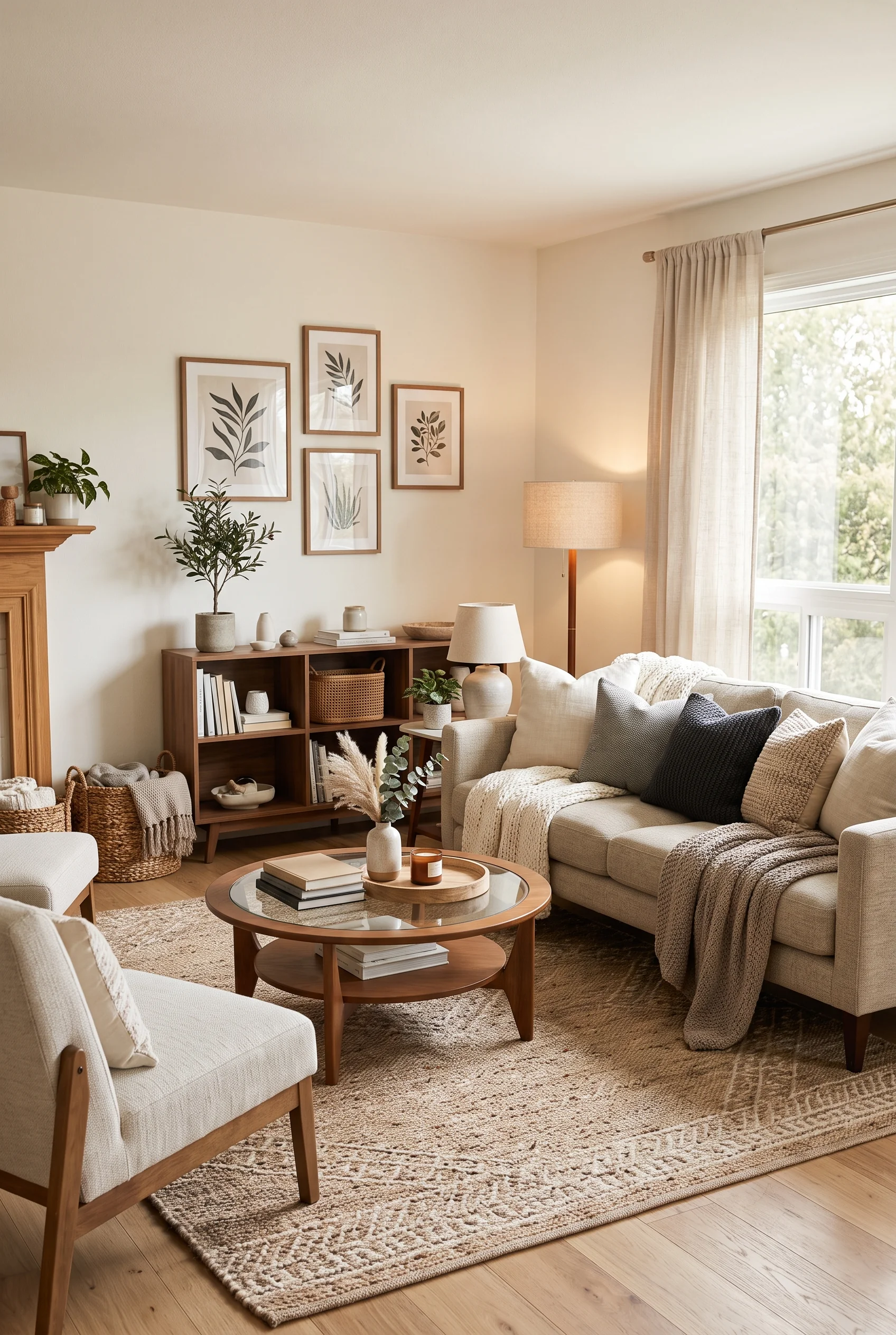
A stack of pillows in cream, charcoal, and woven tan does more work here than any single accent color could. Each one has a different weave, so the sofa reads as collected rather than matched off a single showroom set.
The chunky knit throw pooling over the arm is the detail that makes the whole corner feel used rather than staged. Pair that with the low glass-topped coffee table and a jute-bordered rug underfoot, and the room quietly signals that everything within reach is meant to be touched.
Even the botanical prints on the wall stay soft and sketch-like, never competing with the layers below them.
Two Rugs Read Better Than One
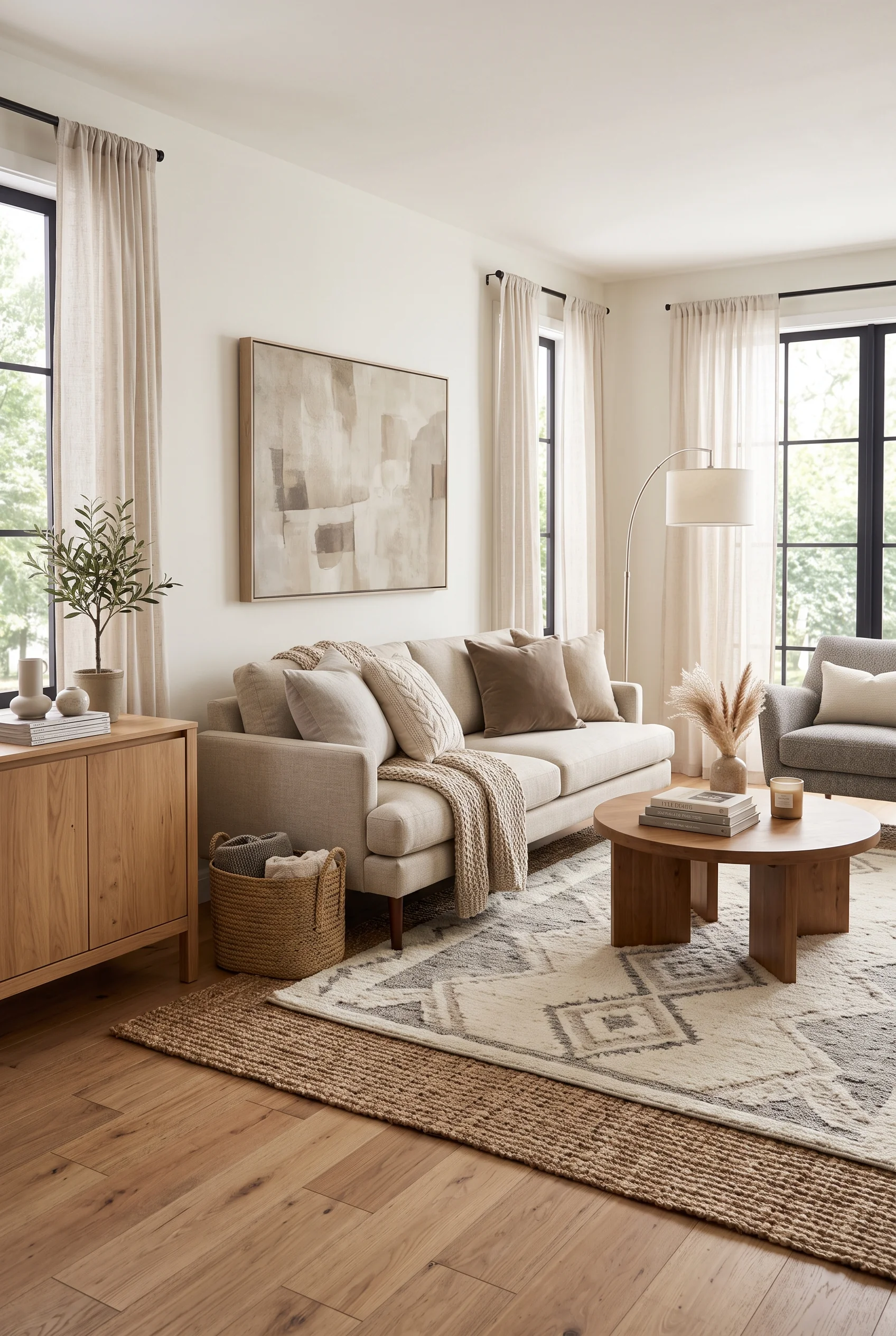
Layering a flat jute rug under a plush patterned one is an easy trick that reads as considered, not fussy. The jute adds a hard-wearing base and a warm undertone, while the softer rug on top brings the pattern and the place to actually sit.
It also solves a practical problem: a jute rug alone can feel scratchy underfoot in a living room, and a soft rug alone can look like it is floating in a bigger space. Together, the two anchor the whole seating arrangement.
The gray sofa and neutral armchair stay simple, because the floor is already doing the visual heavy lifting.
Pillows Do the Heavy Lifting Here
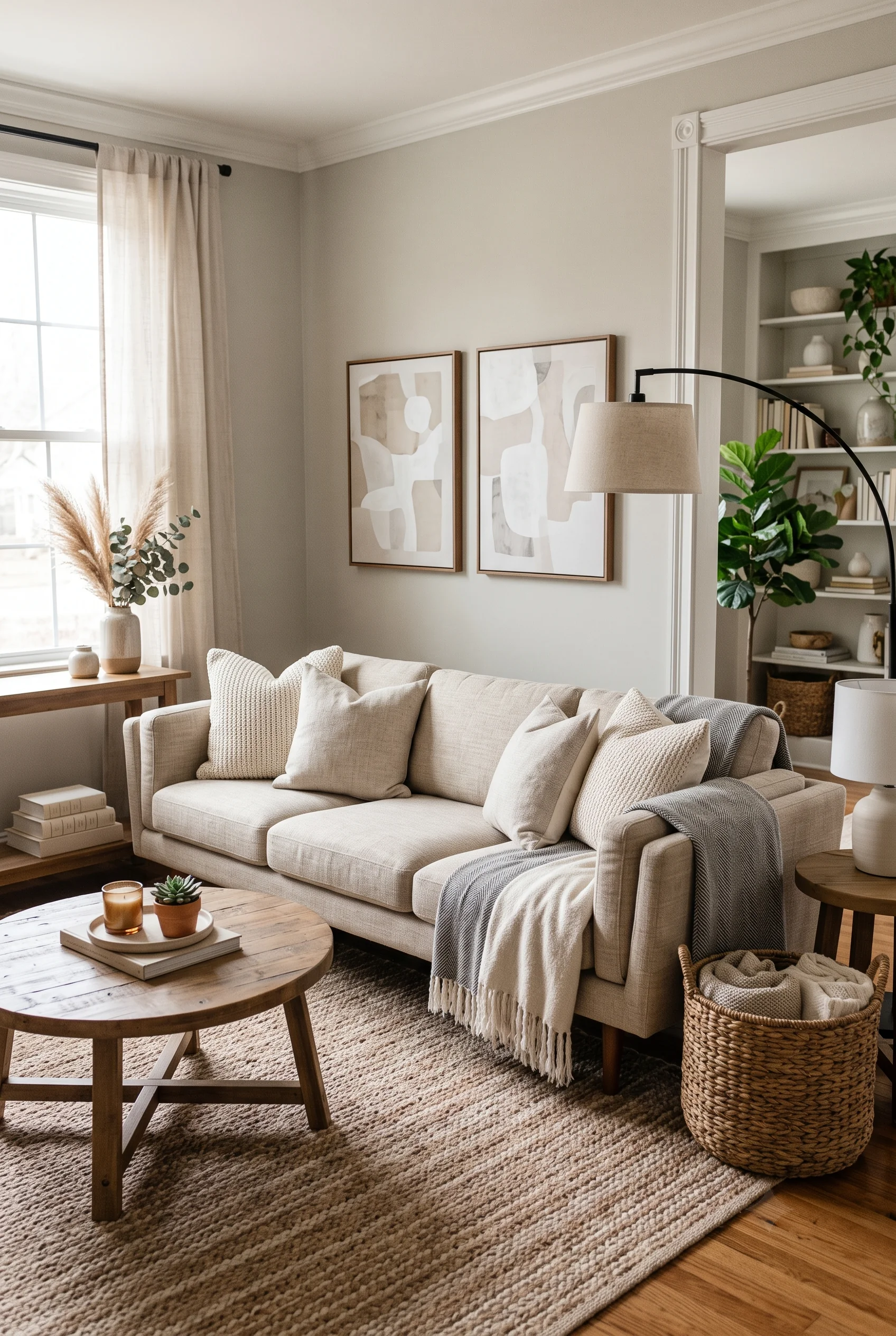
Against a moody, deep taupe wall, a gray sofa could easily disappear. Instead, a mustard velvet pillow, a woven tan one, and a cream knit throw pull just enough warmth forward to keep the whole corner from reading as cold.
None of it depends on a bold accent wall or a single statement piece. A handful of textiles do quiet, coordinated work, chosen so no two pillows share the same fabric.
Nearby brass lighting picks up the same warmth, so the metal and the textiles tell the same story.
Leather and Boucle Make an Unlikely Pair
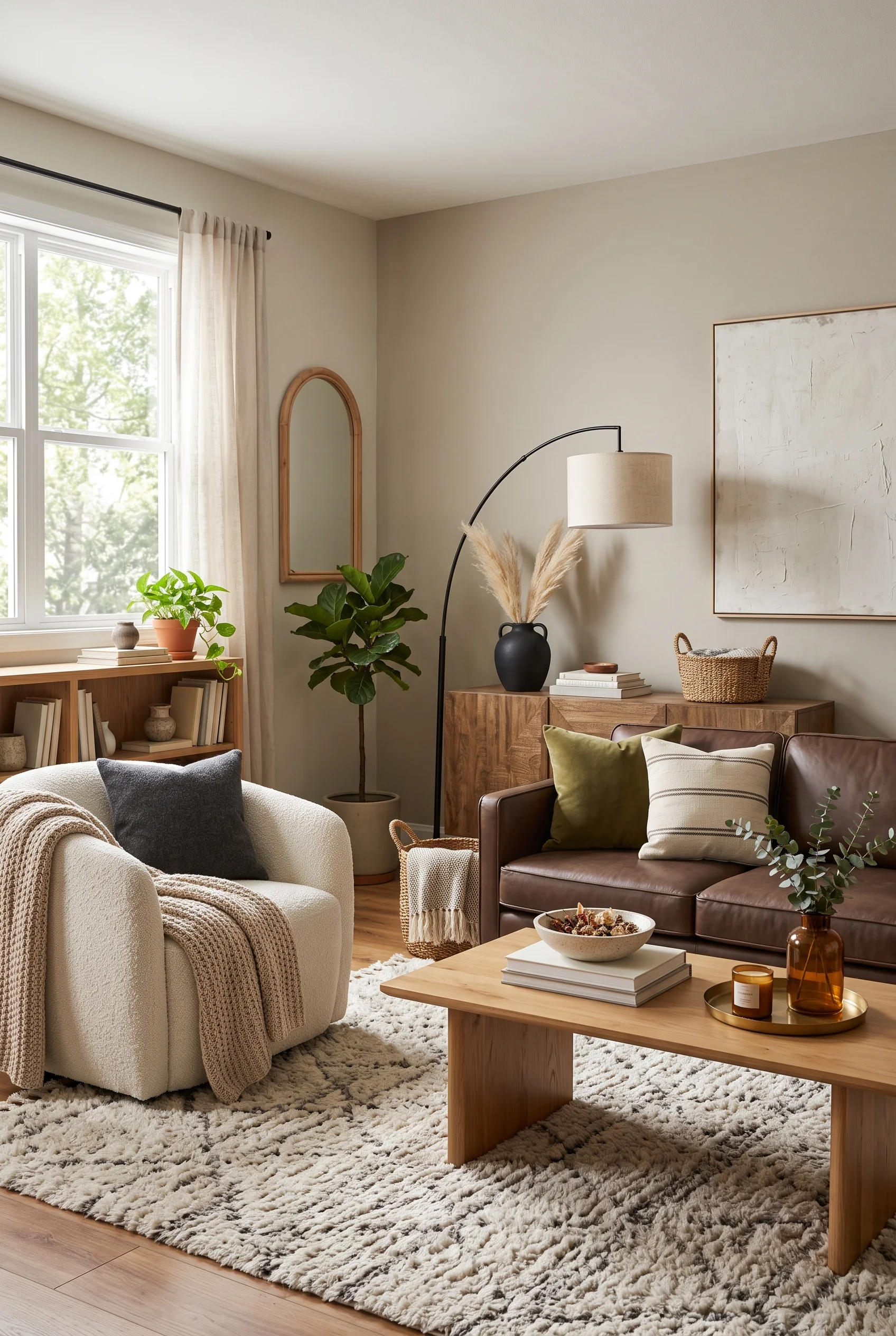
A caramel leather sofa and a cream boucle swivel chair should not necessarily get along, but the shared neutral undertone lets both textures shine without competing. One is smooth and structured, the other soft and nubby, an unlikely combination that never quite settles into a matched set.
A ladder shelf leaning against the wall adds another texture again, this time raw wood next to woven baskets and dried stems.
Done with restraint, texture contrast like this reads as intentional, never mismatched.
Shop the Room
Built for Sinking In, Not Just Sitting
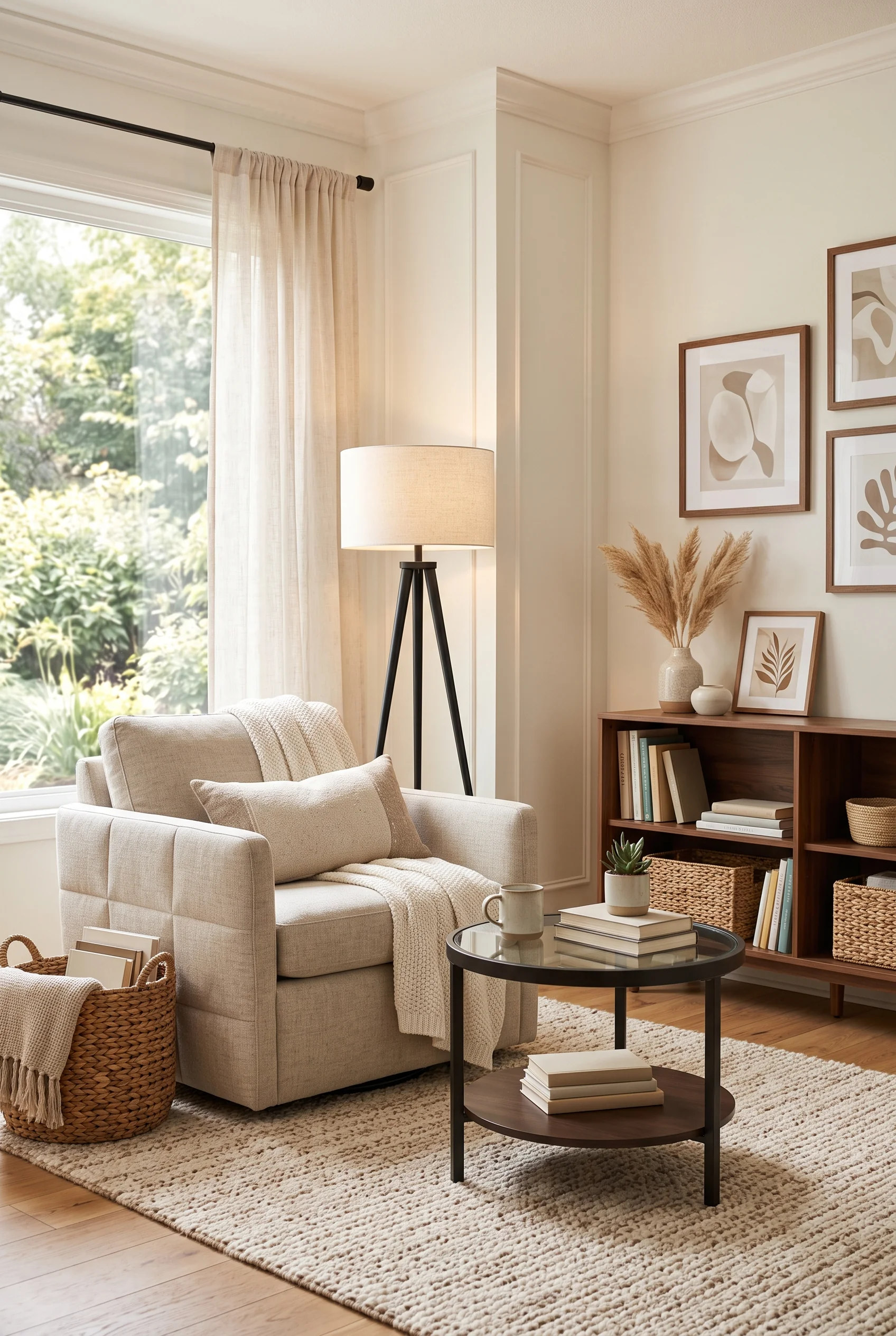
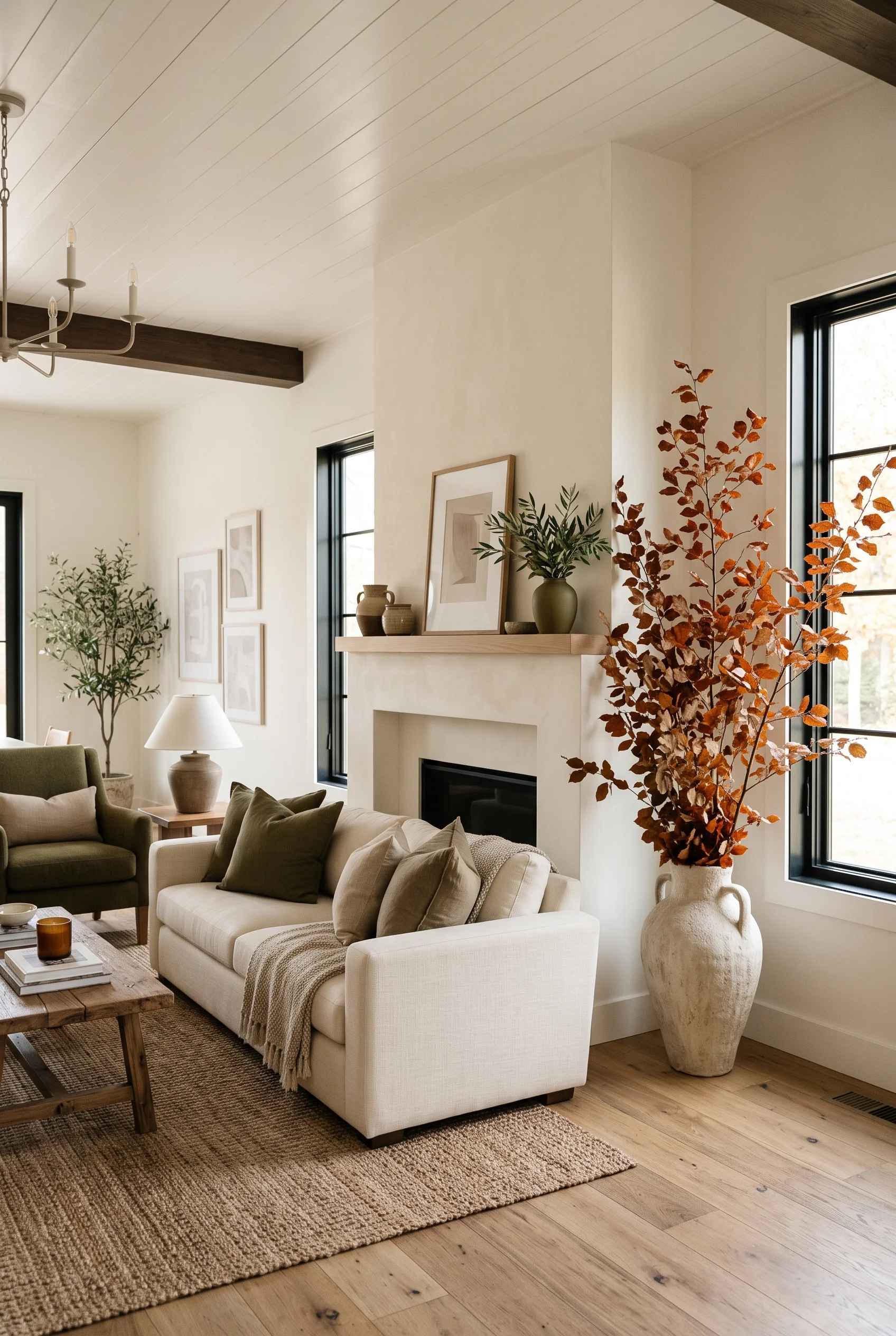
A cream sofa with soft, rounded cushions is the centerpiece of a room built around comfort first. Nothing about the silhouette is sharp or formal, which matters more than it sounds: soft upholstery invites people to curl up rather than perch.
A glass coffee table keeps the seating from feeling heavy, and a gallery of abstract prints behind it stays quiet enough not to compete with the sofa’s presence.
Pampas grass in a low vase is the only decorative flourish the room really needs.
A Neutral Palette Without the Blank Slate
Neutral gets a bad reputation for being boring, usually because people confuse it with beige walls and nothing else. The rooms below run a much wider range: warm tan next to crisp white, soft pattern next to plain linen, wallpaper texture next to painted drywall. The goal is not sameness. It is a palette calm enough to let everything else in the room- plants, art, people- feel like the main event.
This Bedroom Never Raises Its Voice
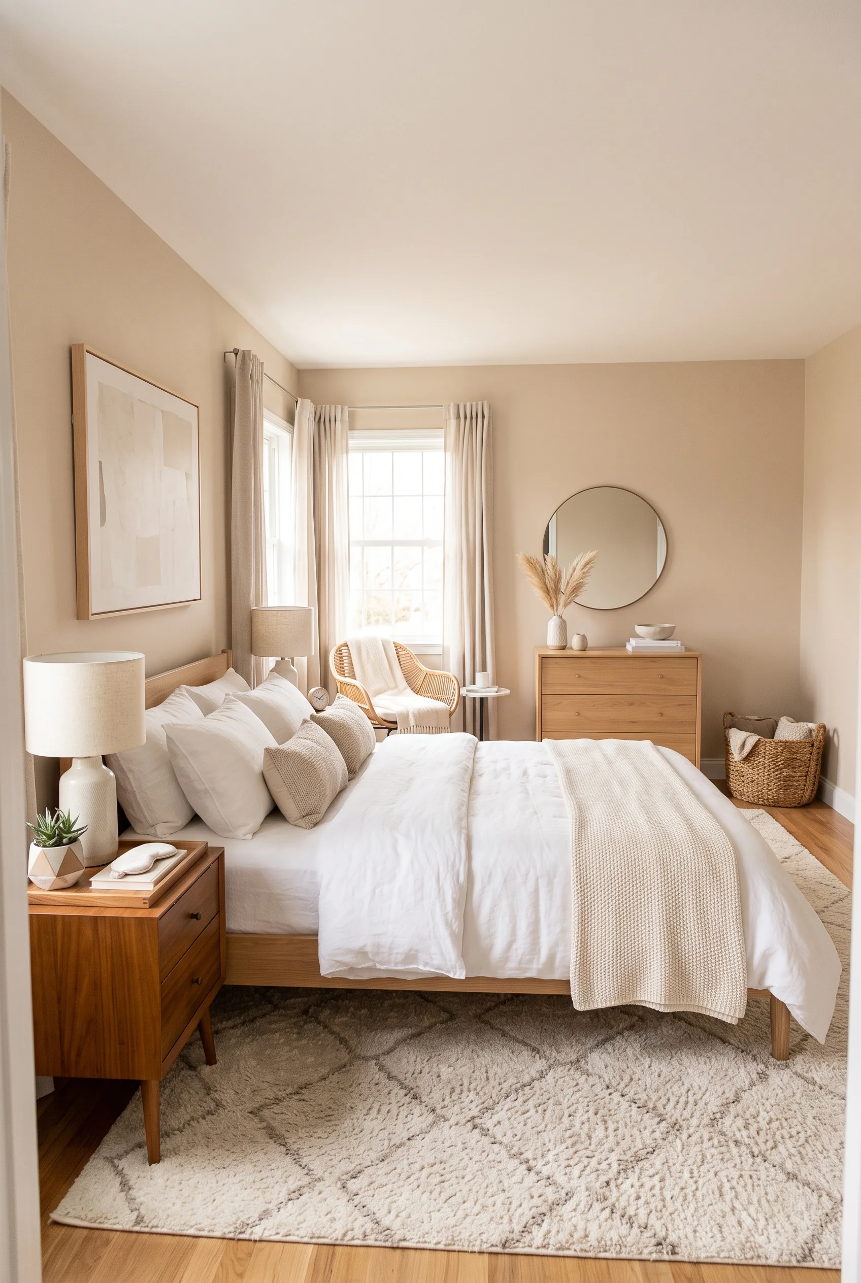
Soft beige walls and crisp white linen bedding sound simple on paper, but together they create a room that feels genuinely restful rather than just unfinished. The palette barely shifts from wall to bed to dresser, so nothing pulls focus.
A round mirror and a rattan accent chair add just enough shape and texture to keep the room from flattening out.
Dried pampas grass on the dresser is the only decor that moves with the light through the day.
Proof That White Is Not One Color
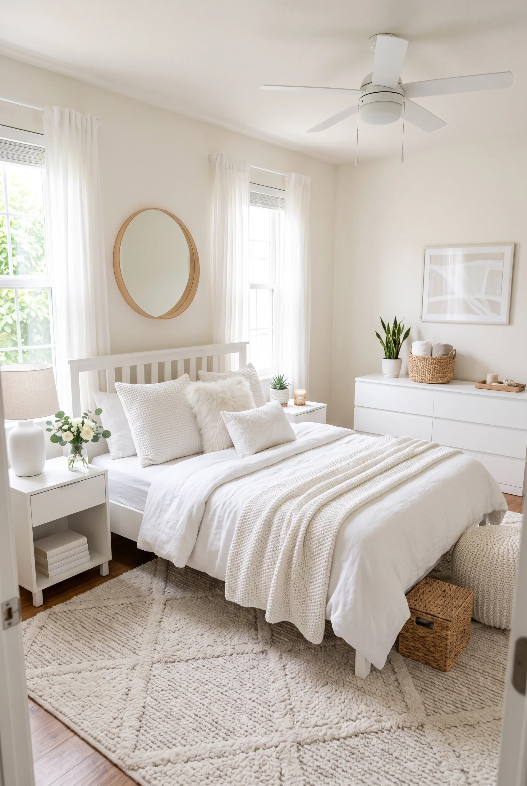
Look closely, because this room is not actually white. It is a dozen close shades of it: warm ivory bedding, a cooler white dresser, and a faded oatmeal rug. Even the linen lampshade leans slightly yellow next to all of it.
That subtle variation is what keeps an all-white room from feeling clinical. If every surface matched exactly, the room would read as sterile instead of soft.
A single fern and a small vase of white roses are the only color accents allowed in, and even those stay firmly in the same family.
Pattern in Small Doses Still Counts
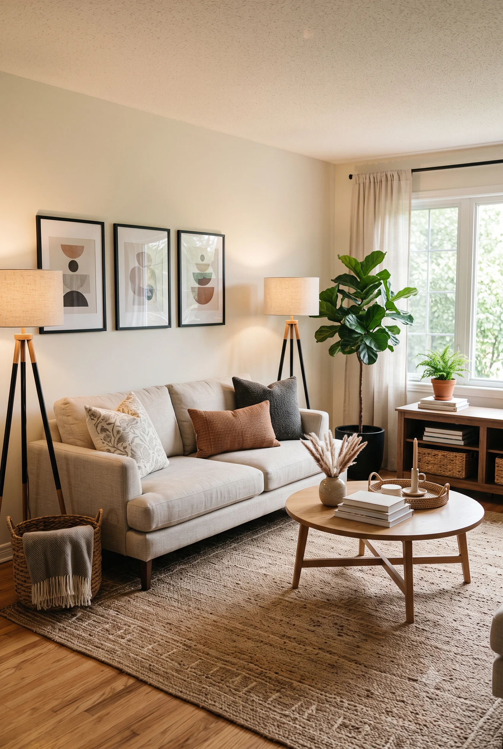
A neutral sofa does not have to be plain. Here, a floral cushion, a geometric brown one, and a solid charcoal pillow all sit together, proving that pattern and neutral are not opposites.
The trick is keeping the palette tight. Every pattern pulls from the same tan, cream, and charcoal range, so nothing reads as loud even though there is plenty going on across the cushions.
A trio of abstract prints on the wall behind repeats the same restrained color story, tying the whole seating area together.
A Whisper of Color, Nothing Louder
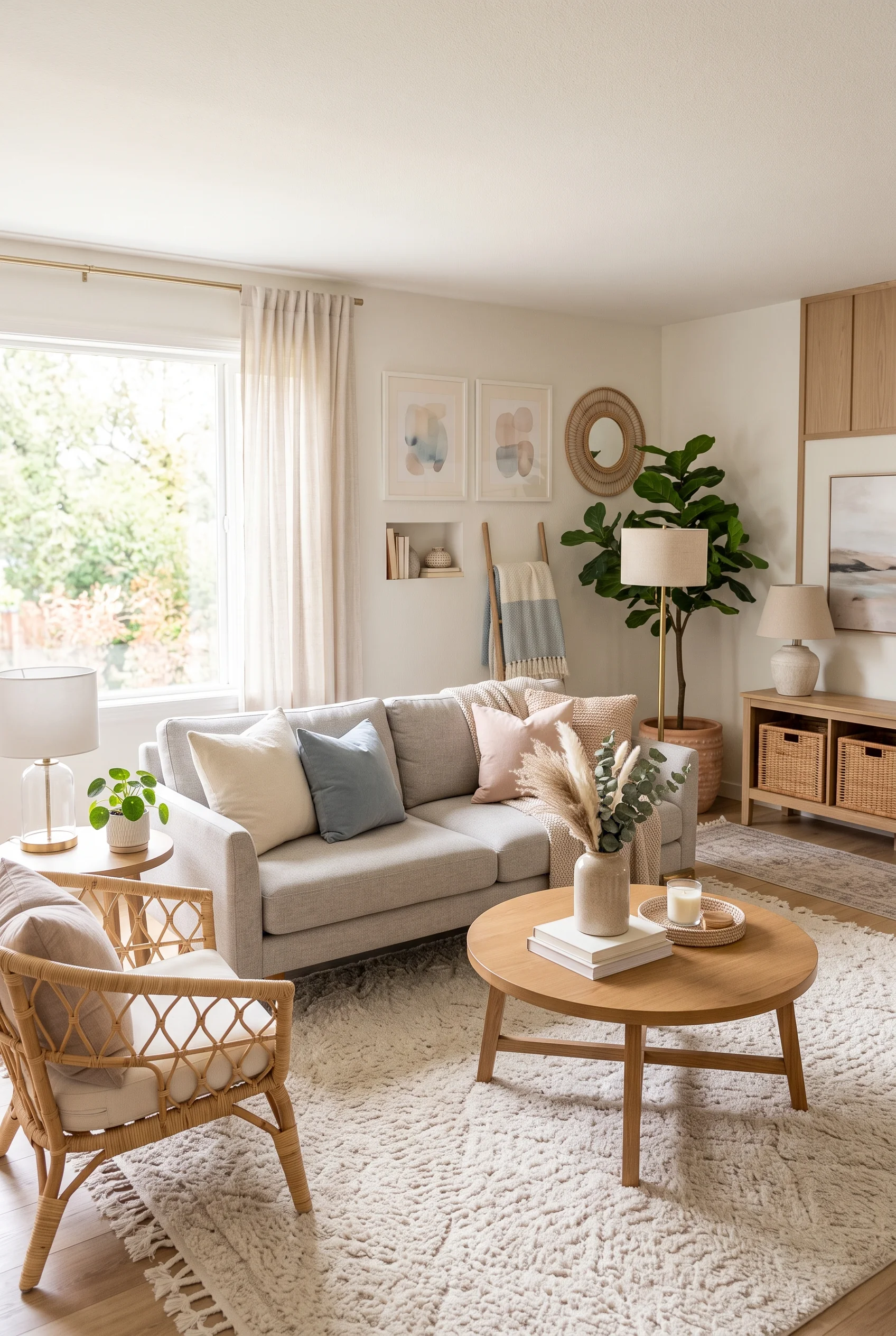
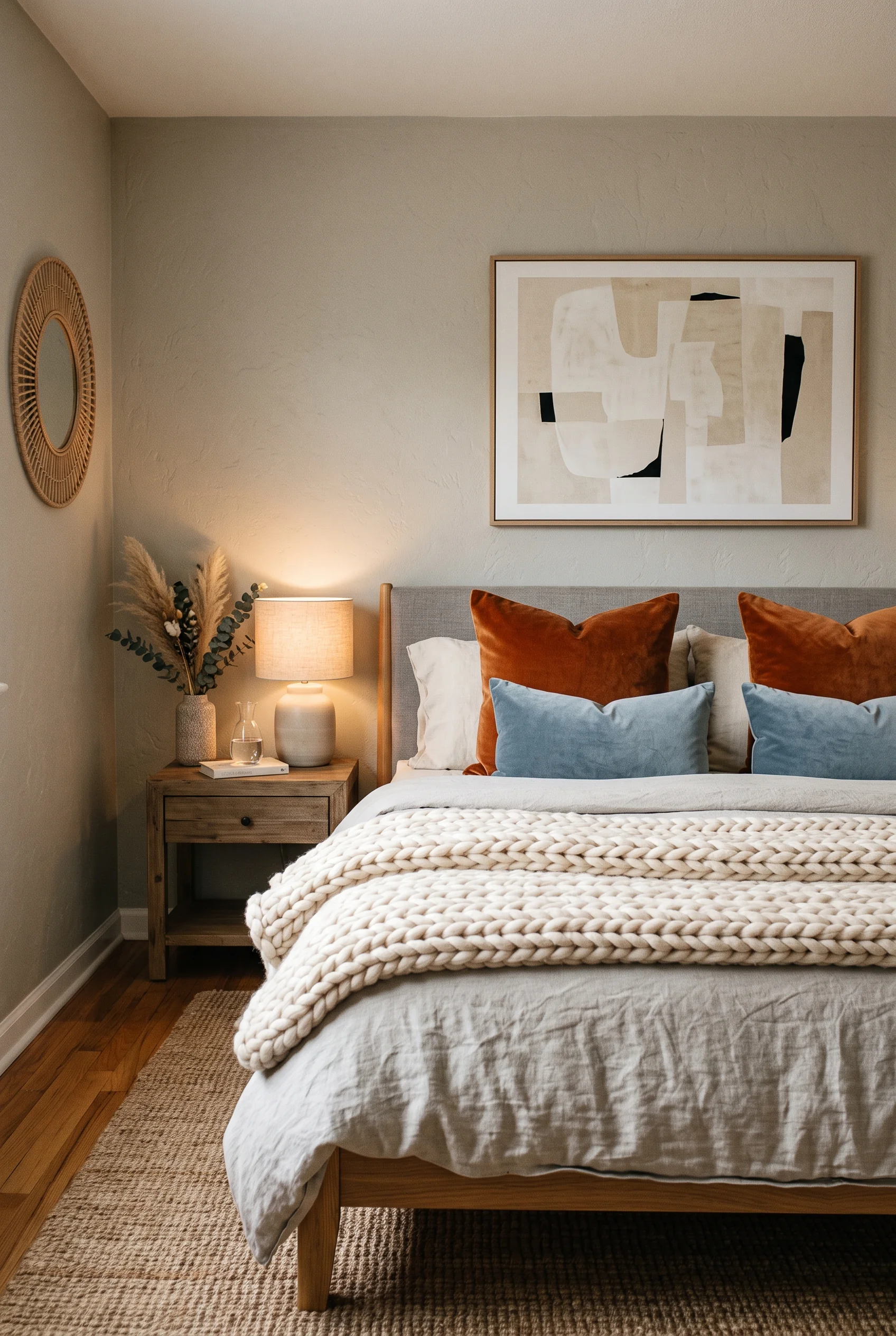
Blush and dusty blue show up here as pillows, nothing more, a small dose that carries more weight than a bolder choice would. In a fully neutral room, even a small amount of color reads as a deliberate accent instead of a random addition.
The rattan mirror and woven armchair keep the materials varied enough that the room never feels like it is missing color. It simply is not the point.
A round mirror doubles the light from the window, so the soft palette never turns dim.
Wallpaper Without a Single Loud Color
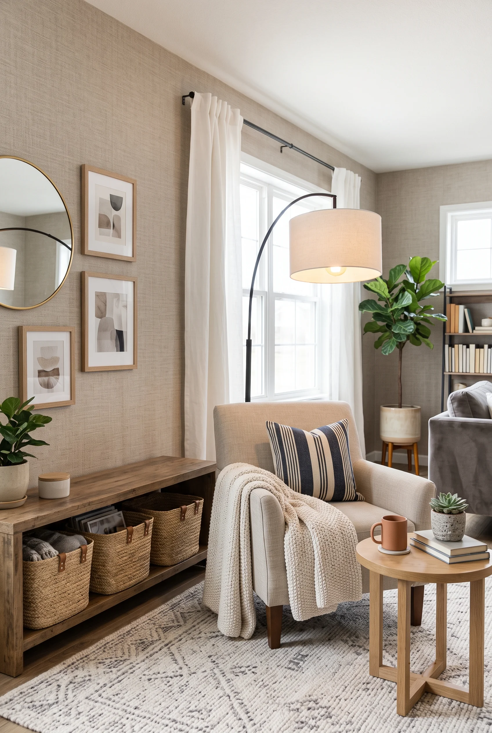
A grasscloth-look wallpaper in a warm taupe adds texture to the walls themselves, a detail plain paint cannot fake. From a few feet away, it reads almost like linen.
Layered against a gallery wall of small abstract prints and a striped pillow on a cream chair, the wallpaper stays in the background exactly where texture belongs. It never has to compete for attention.
The upgrade changes how the room feels to stand in, a shift most people notice only after they’ve already relaxed into it.
Furniture That Actually Earns Its Keep
Minimal does not mean empty, and empty is not always the goal anyway. The most functional neutral rooms tend to have less furniture, not more, but every piece left in the room is doing at least two jobs: storage and seating, display and organization, style and actual daily use. These five spaces show what that looks like when it is done well, rather than just sparsely.
Empty Corners Are Doing Something Right
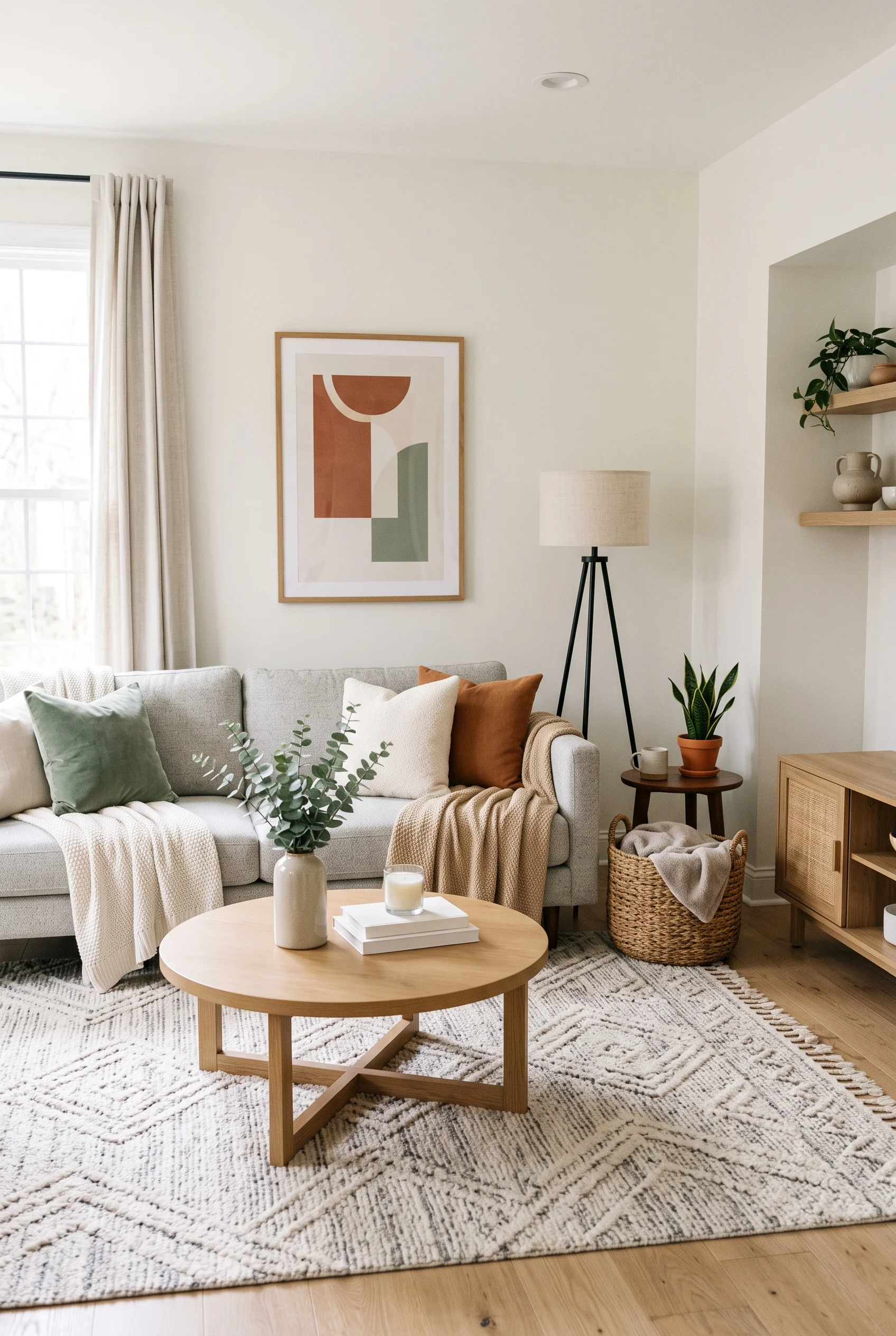
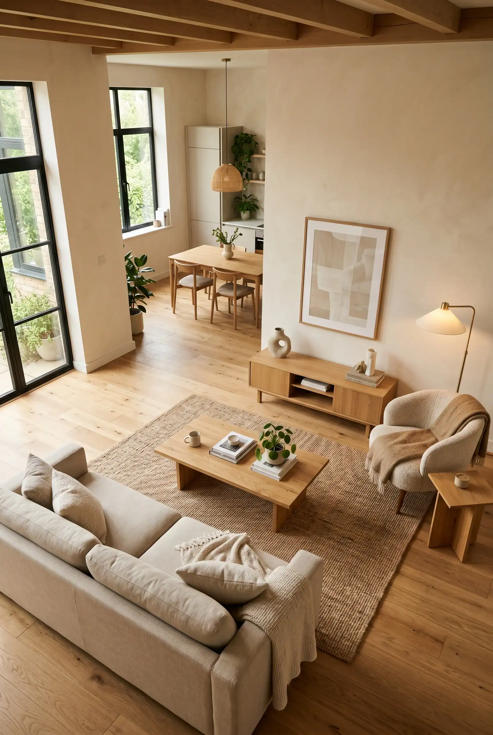
A room this open could easily feel unfinished, but the negative space is doing real work. A single gray sofa, one round coffee table, and a floor lamp are enough because nothing is fighting for attention.
Terracotta and sage in the abstract art above the sofa are the only real color in the room, and even they stay muted enough not to break the calm.
If minimalist furniture in a smaller room still feels like a stretch, our Minimalist Kids’ Room Ideas guide breaks down how the same restraint scales down without feeling sparse.
Storage That Does Not Look Like Storage
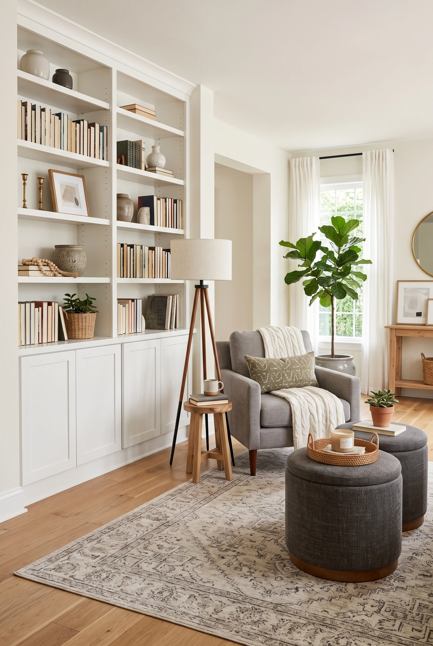
White built-in shelving holds books, vases, and framed art, but the real functional heroes are two round ottomans that double as a coffee table. Lift the lid, and there is space for blankets and remotes, whatever usually ends up scattered across a living room floor.
A gray tripod lamp and a single olive pillow keep the palette from feeling too matchy, while a plush wool rug underneath makes the built-ins feel warm rather than office-like.
None of the storage in this room announces itself, tucked behind lids and clean lines instead.
Furniture With a Second Job
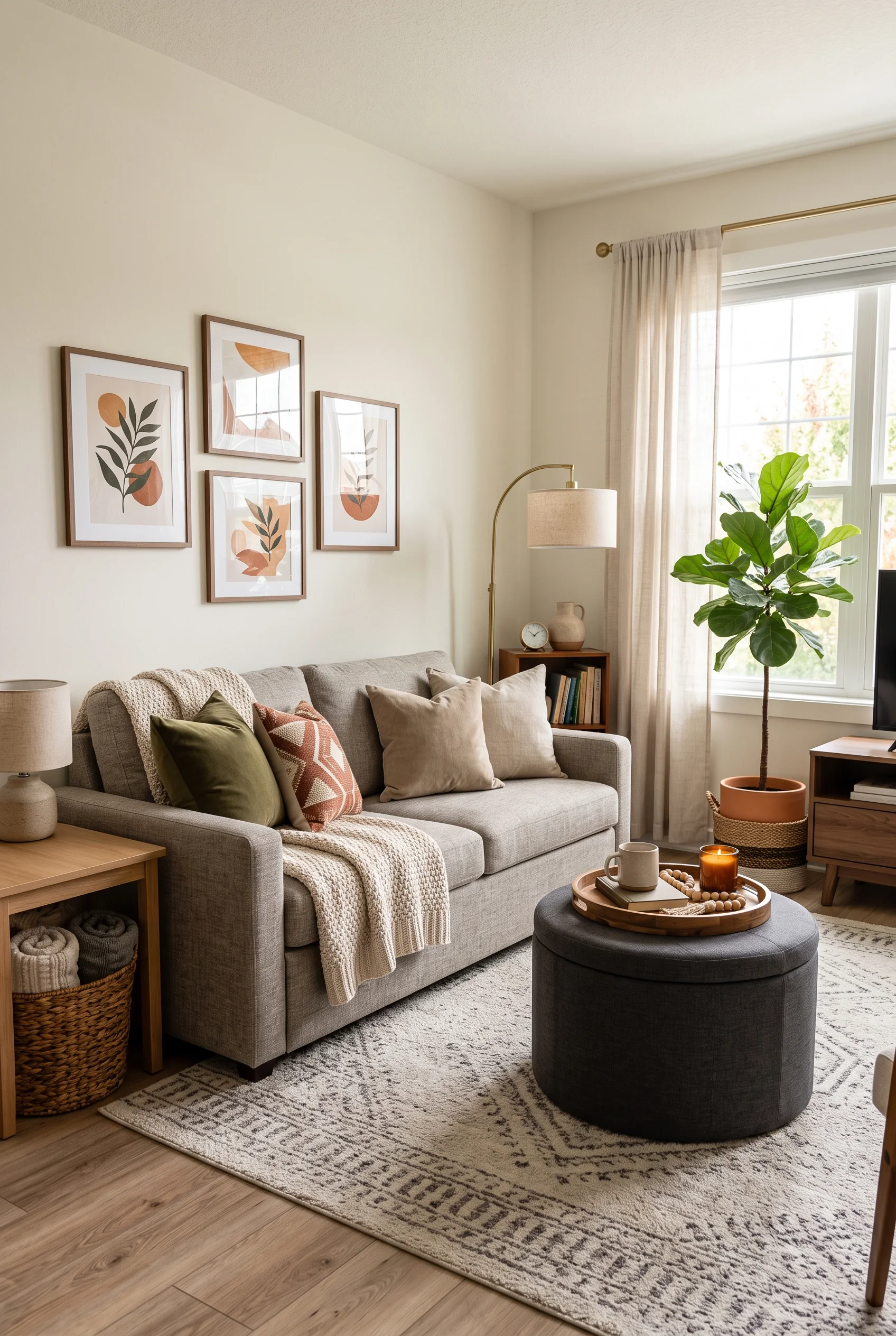
A round storage ottoman takes the coffee table spot here: a tray of candles and books on top, blankets hidden underneath. A piece like that can make a small living room feel bigger than its actual square footage.
The gray sofa, layered with rust, olive, and tan pillows, keeps the room from feeling like a showroom display built around function alone.
A gallery of botanical prints above the sofa adds just enough visual interest without asking the furniture to do double duty as decor too.
Everyday Dishes as the Only Decoration Needed
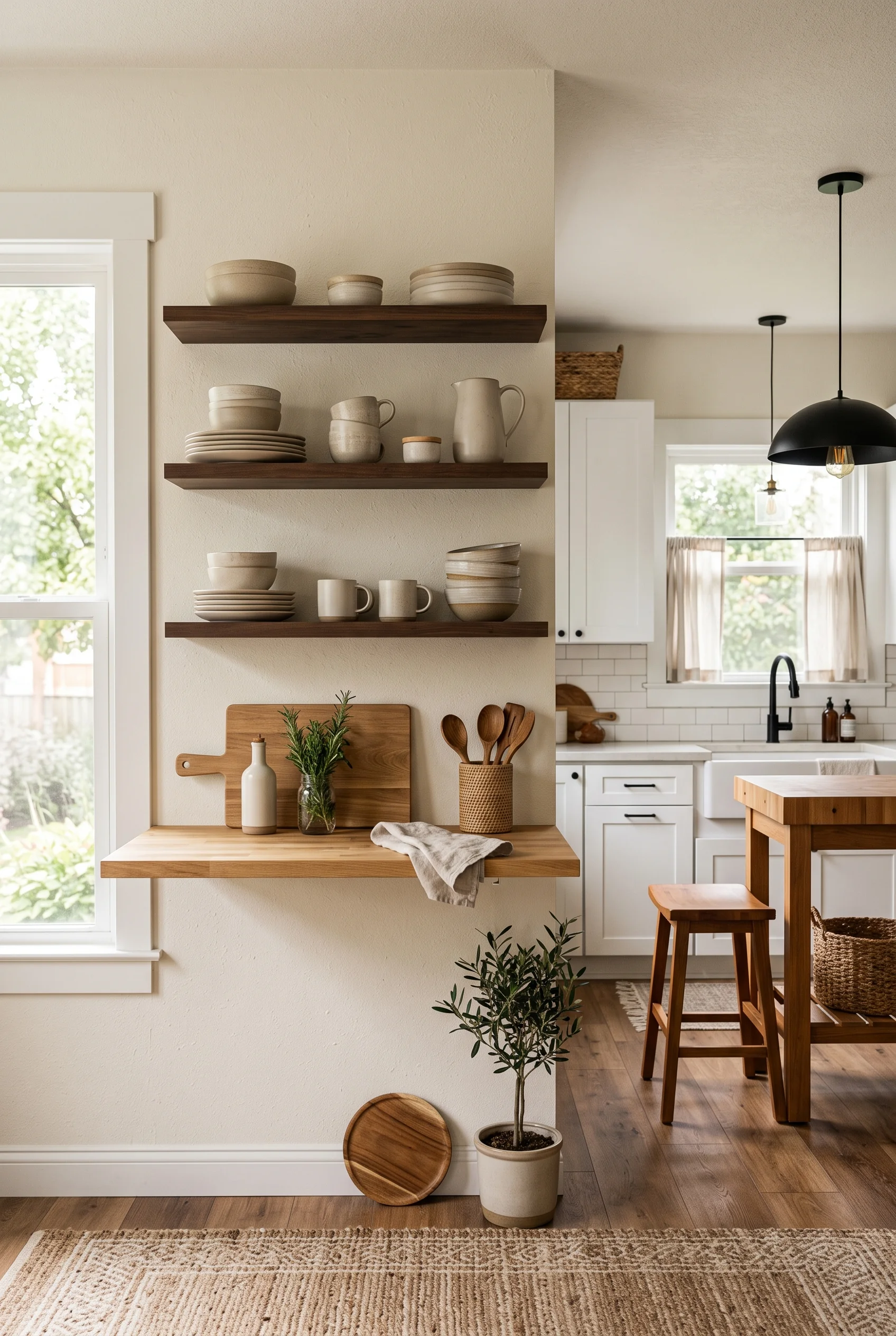
Open wood shelving in this kitchen holds nothing but the dishes actually in rotation: stacked bowls, mismatched mugs in the same warm tone, a stoneware pitcher. Nothing here was bought purely to look good on a shelf.
Open shelving like this withstands daily use, unlike just a photograph. Everything visible earns its spot by being used weekly, and the muted color palette across the ceramics means nothing clashes even without a plan.
A small potted olive tree at the base softens all that hard wood and tile.
This Chair Is Not Trying to Match Anything
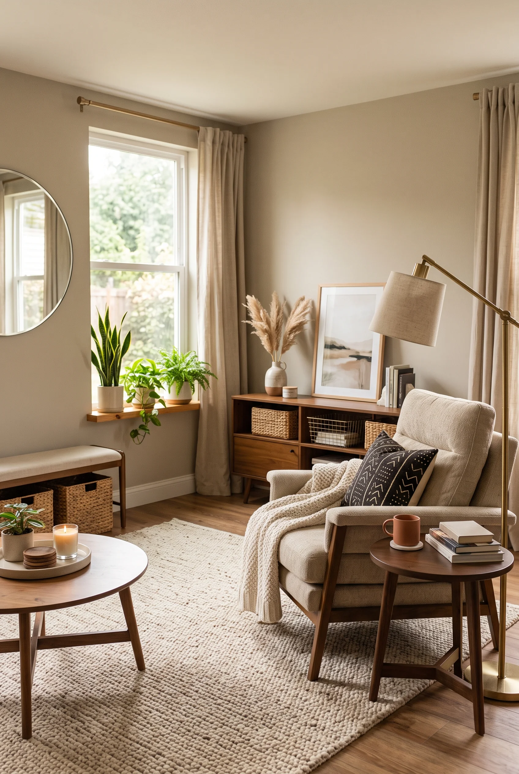
A boucle swivel chair in warm cream, draped with a rust knit throw, is allowed to be the one piece in the room that does not match the rest of the furniture exactly. That is what makes it read as a statement rather than filler.
A ladder shelf behind it holds dried pampas grass and a small framed print, adding height without adding another piece of case furniture to fit.
The chair works because everything around it stays quiet enough to let it stand out.
What Natural Materials Bring to a Neutral Room
Take away color and pattern, and material does most of the visual work. Rattan, jute, and raw wood bring warmth and texture that paint alone cannot fake, with living plants rounding out the effect. These four rooms lean on natural materials, rather than manufactured texture, to keep an all-neutral space from feeling cold or synthetic.
When a Room Has More Plants Than Furniture
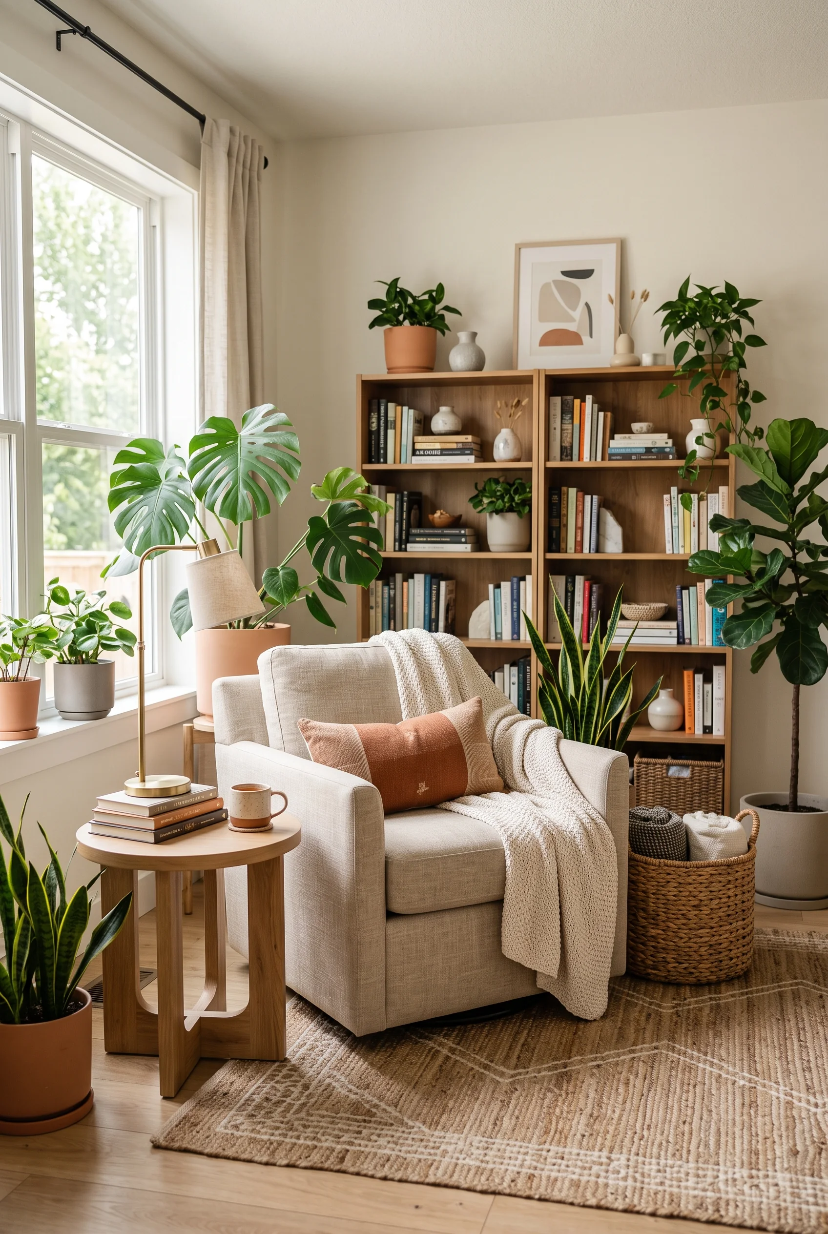
This reading corner is crowded with green: a monstera, a fiddle leaf fig, and a trailing pothos, with snake plants filling in the lower gaps. Green is the only real color allowed in an otherwise tan-and-cream room.
A packed wood bookshelf behind the chair adds its own kind of texture, spines in every muted shade lining up beside ceramic vases and small framed art.
The plants do more than decorate. They soften every hard edge in the room, from the shelf corners to the window frame.
Wood Tones Set the Table Before the Food Does
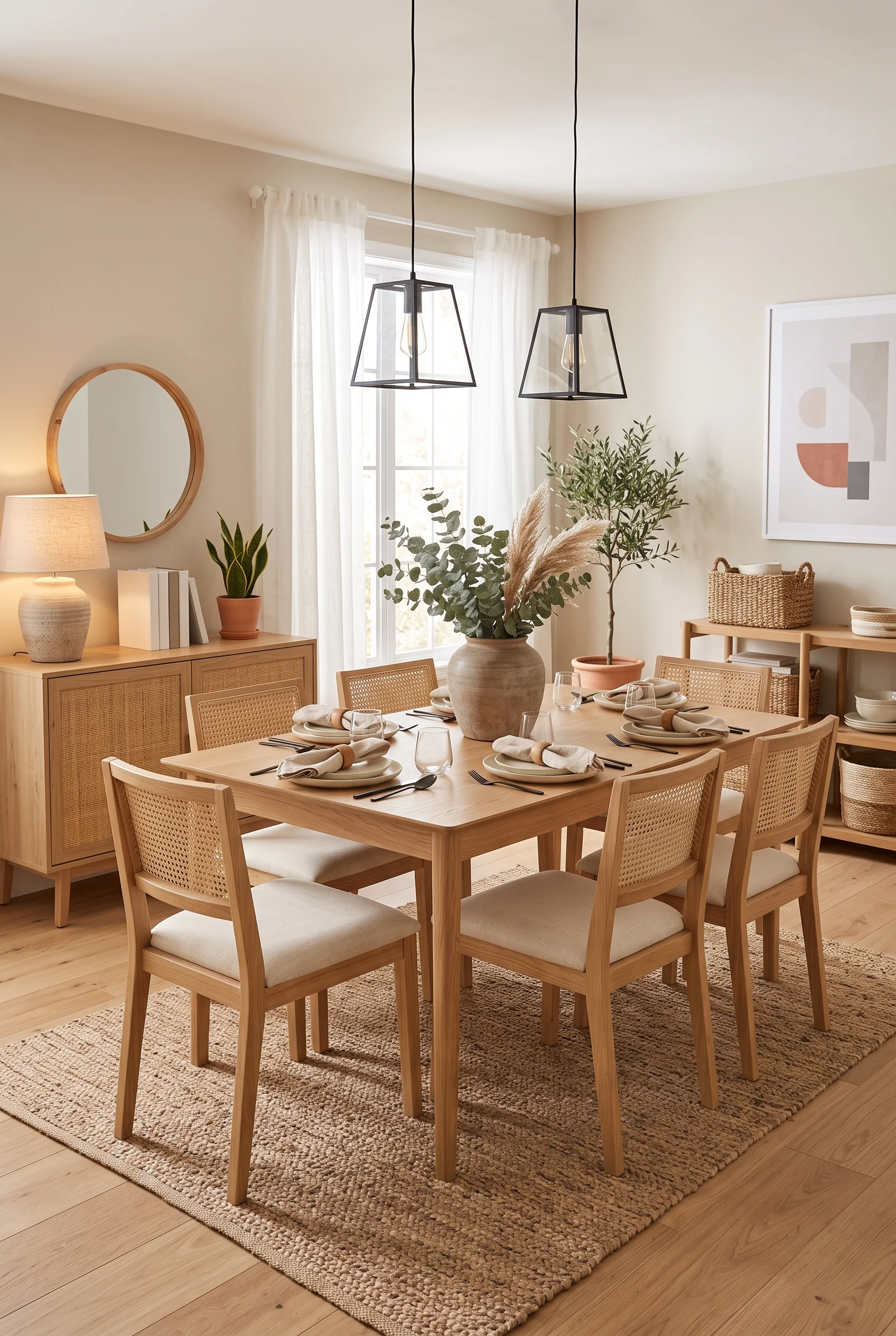
Light oak dining chairs with woven cane backs, a matching table, and a wood credenza all share the same warm undertone, so the room feels cohesive before a single plate is set down.
Black lantern pendants overhead add contrast without breaking the wood-forward palette, and a stoneware vase of eucalyptus and pampas grass keeps the centerpiece firmly in the same natural material family.
Even the round mirror across the room picks up a wood frame instead of metal, so the whole space stays in conversation with itself.
Woven Textures Warm Up a Cool Palette
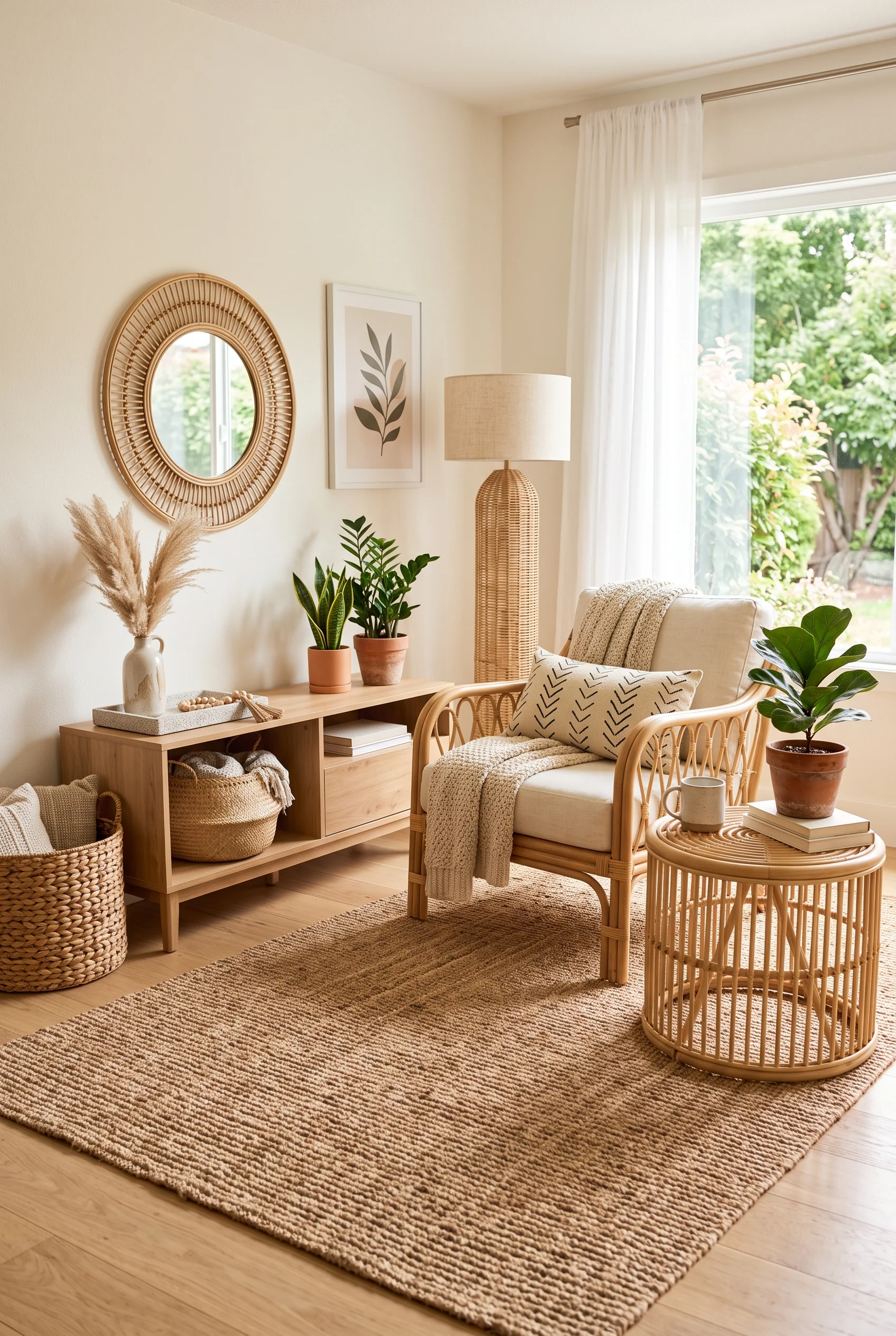
A rattan mirror, a rattan-and-linen lamp, and a cane accent chair all bring the same woven texture into one corner, and together they keep a mostly beige room from feeling flat.
Snake plants and a ZZ plant add another layer of natural material, while a low rattan drum table gives the whole seating area a grounded, slightly relaxed feel.
None of it reads as themed or overly bohemian. It simply feels like a room that prefers texture to color.
Dried Stems Outlast Every Trend
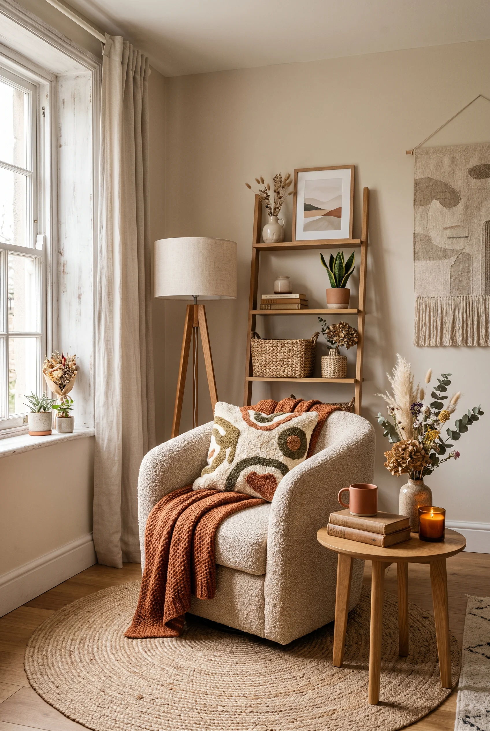
Pampas grass and a mixed arrangement of dried hydrangea sit on a wood ladder shelf, next to framed landscape art and a woven basket. Unlike fresh flowers, none of it needs replacing next week.
A rust knit throw over a cream boucle chair adds the season’s only real color, while a jute round rug keeps the whole corner grounded in natural fiber.
It is a low-maintenance way to bring the outdoors in, without committing to houseplants that need actual care.
Light Is the Room’s Quiet Architect
A neutral palette lives or dies by its light. Without color to create contrast, a room depends on mirrors, lamps, and window treatments to keep it from feeling flat or dim. These four spaces show how light gets shaped, bounced, and softened well before anyone notices it is the reason the room feels so calm.
A Hallway Borrows Light It Does Not Have
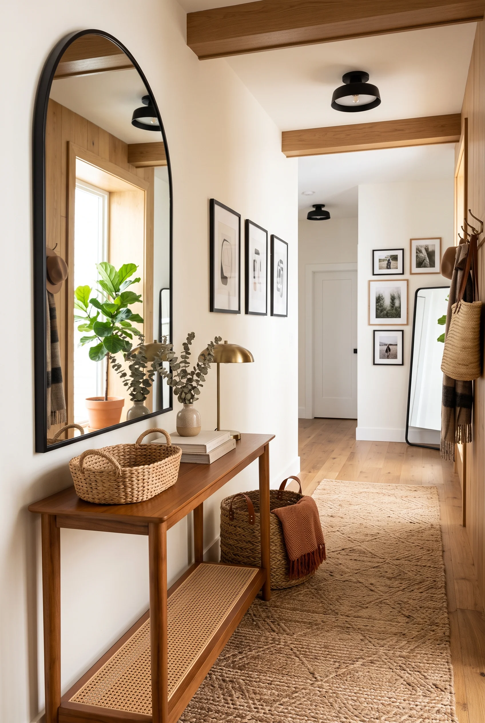
A large arched mirror across from a window doubles the light in a hallway that would otherwise stay dim most of the day. It is a simple trick, but an effective one in any narrow, window-poor space.
Below it, a wood console holds a brass lamp and a vase of eucalyptus, and the gallery wall beside the mirror gets reflected back into the room a second time.
The hallway ends up feeling twice as bright as its actual window count would suggest.
Lamps Do What Overhead Light Never Could
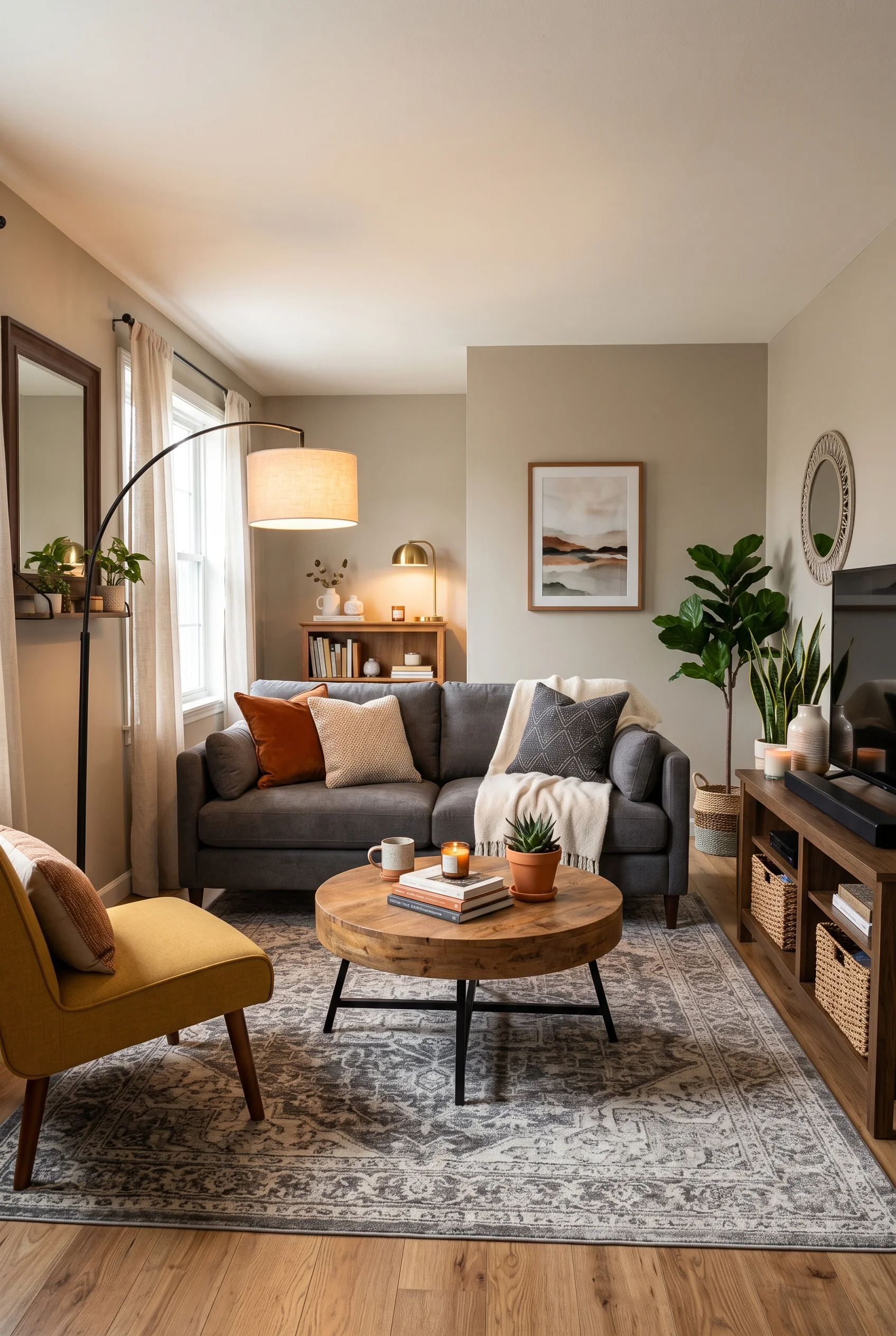
A brass table lamp and a matching floor lamp cast warm, low pools of light across this living room, and the effect is instantly cozier than any ceiling fixture could manage on its own.
A mustard accent chair picks up the same warm tone the lamps throw off, so the whole corner feels intentionally lit rather than just lit by whatever fixture happened to be there.
Evenings in a room like this rely on layered lamps, not one bright switch by the door.
Curtains That Filter Light Instead of Blocking It
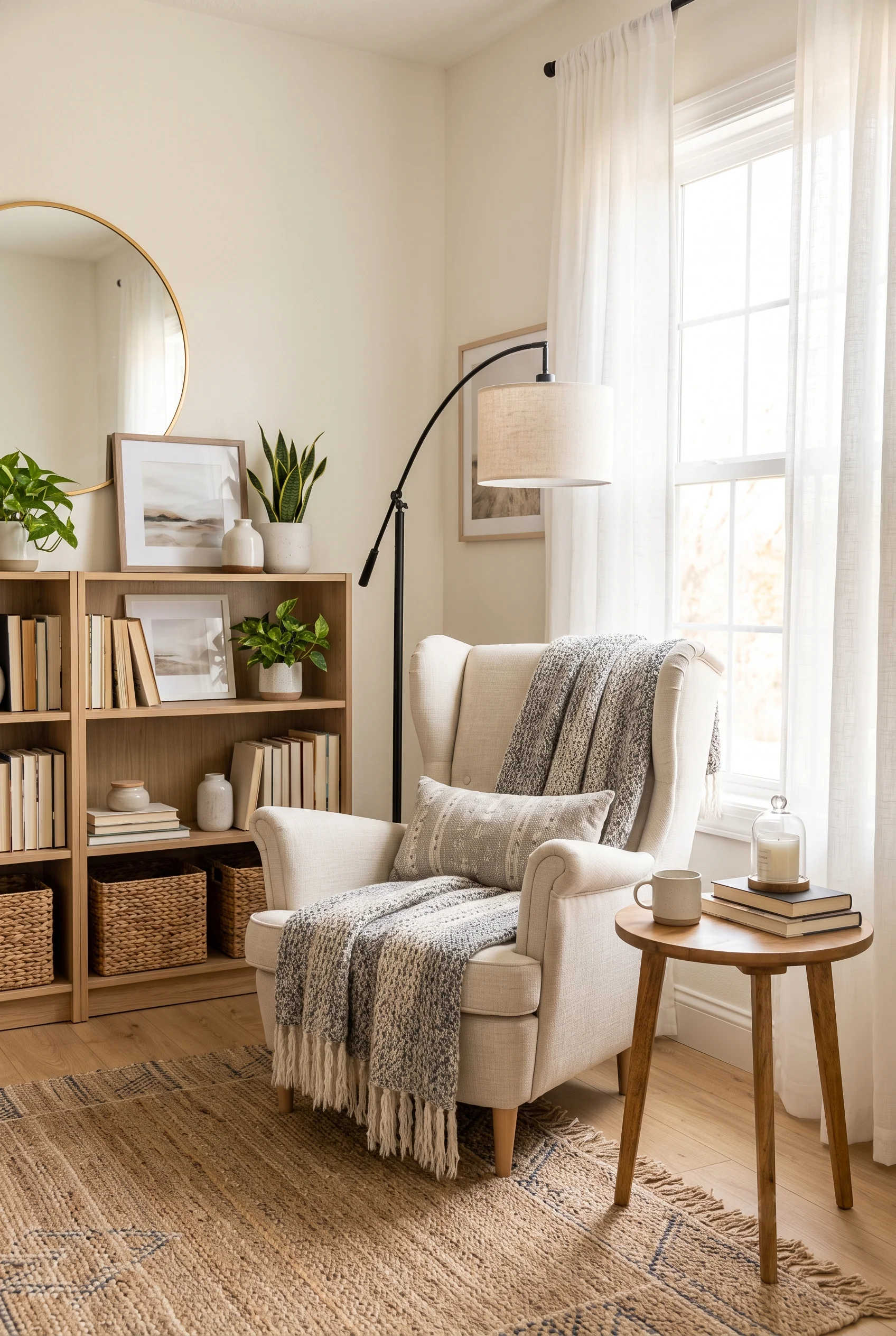
Sheer white curtains let the window stay the brightest thing in the room, without the glare of an uncovered pane. A cream wingback chair sits close by, draped in a knit throw that would look overly heavy in a darker room.
A wood bookshelf packed with framed prints and books fills the corner behind it, but the light from the window keeps the whole nook from feeling closed in.
This corner changes completely depending on the hour, brighter at noon and softer by evening.
The Corner Nobody Has to Talk You Into Sitting In
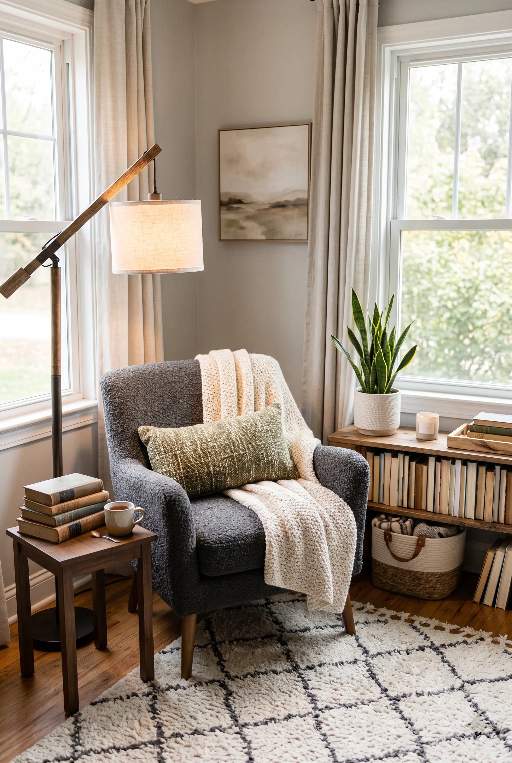
A charcoal boucle chair, a warm reading lamp, and a small side table stacked with books make the case for a reading nook on their own, no convincing required. A cozy reading nook works the same way in a kid’s room as it does here: the chair just has to look better than the couch.
A low wood shelf-console beside it holds baskets and a small plant, keeping storage close without cluttering the actual seating area.
The whole corner works without needing an entire room. One good chair and decent light are all a reading spot really needs.
Small Layers, Real Character
A neutral room can still feel deeply personal, and the difference usually comes down to layering: art, books, and vintage finds. A little shine from metal accents rounds it out. None of it needs to be loud; it just needs to feel collected over time rather than bought in one trip. These six rooms show what that looks like at different scales, from a single statement painting to a shelf of well-worn books.
One Painting Holds the Whole Wall Together
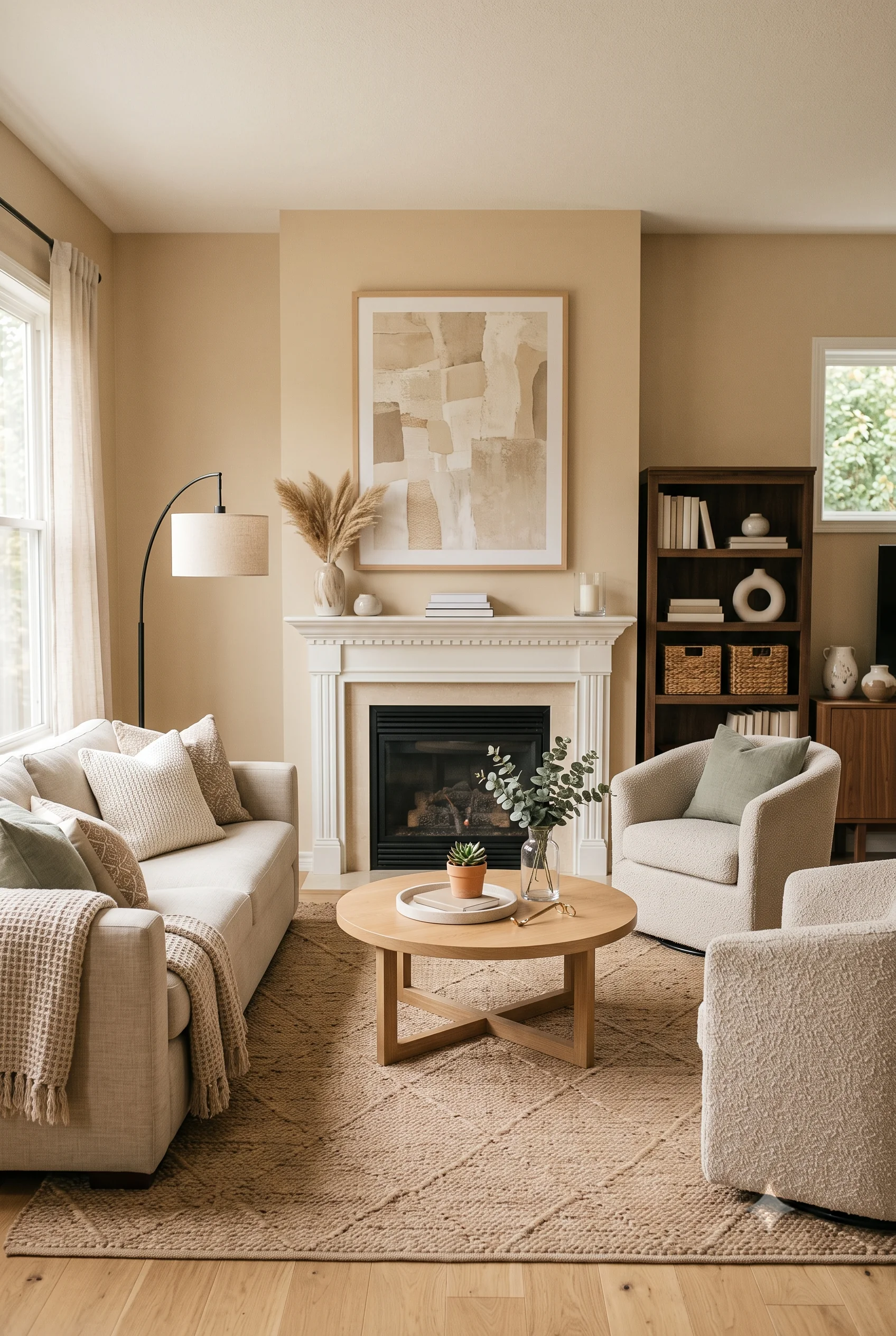
A large abstract painting above the mantel, in soft beige and cream tones, anchors this entire seating area. Without it, the fireplace wall would feel unfinished no matter how well the furniture below was arranged.
A dark wood bookshelf on one side balances the painting’s visual weight, while cream swivel chairs and a low sofa keep the seating itself understated.
Scale matters as much as color choice here. A smaller print in the same palette would have left the wall feeling incomplete.
One Old Chair Keeps the Room From Feeling Staged
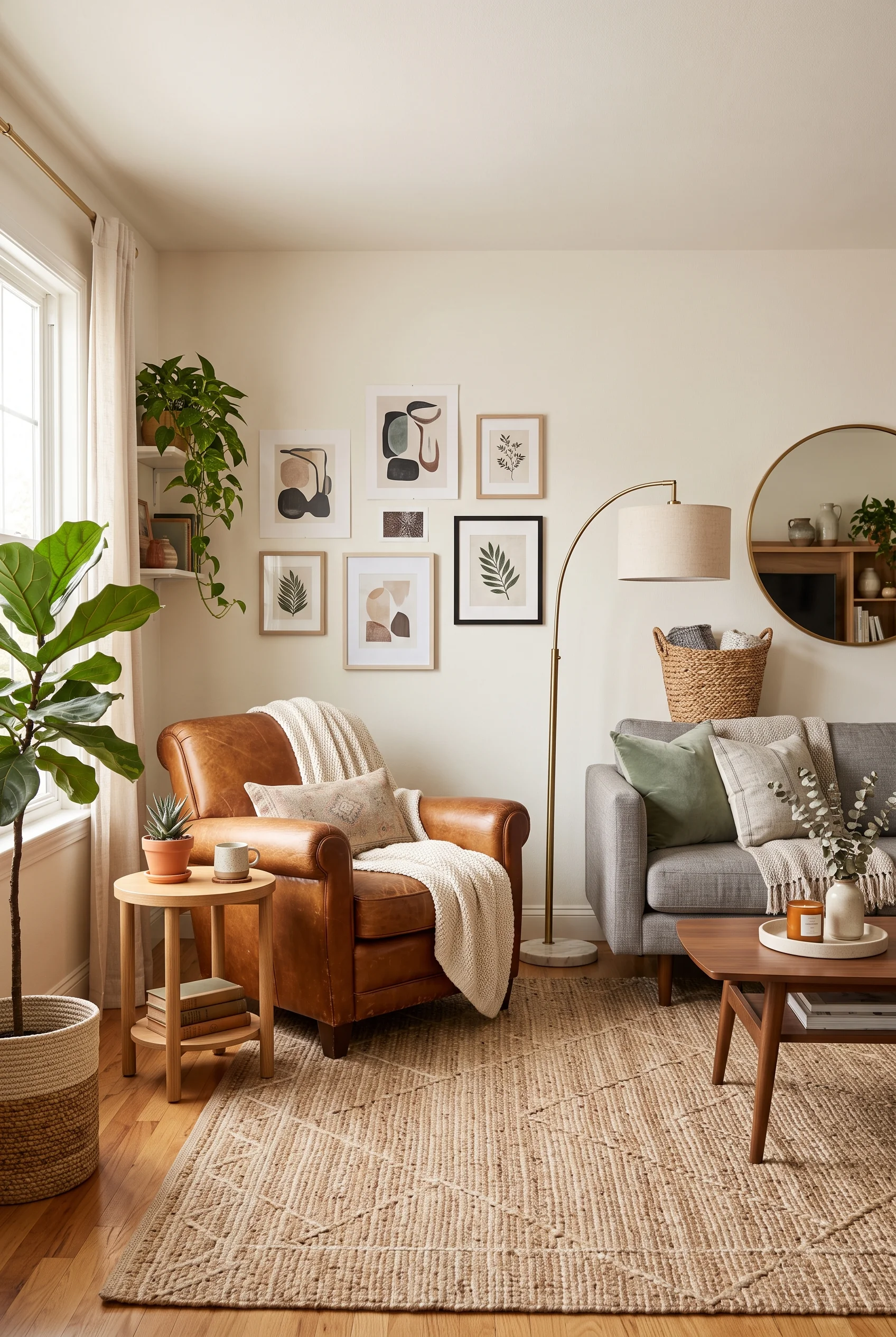
A cognac leather armchair, worn in exactly the right way, sits beside a much newer gray sofa, and that contrast alone stops the room from reading like a single catalog order.
A cream throw and a small patterned pillow soften the leather’s formality, while eucalyptus and a snake plant nearby keep the vintage piece from feeling out of place in an otherwise contemporary room.
Vintage does not have to mean matching. One well-chosen older piece can do more for a room’s character than an entire set of new furniture.
Shelves That Tell You Who Lives Here
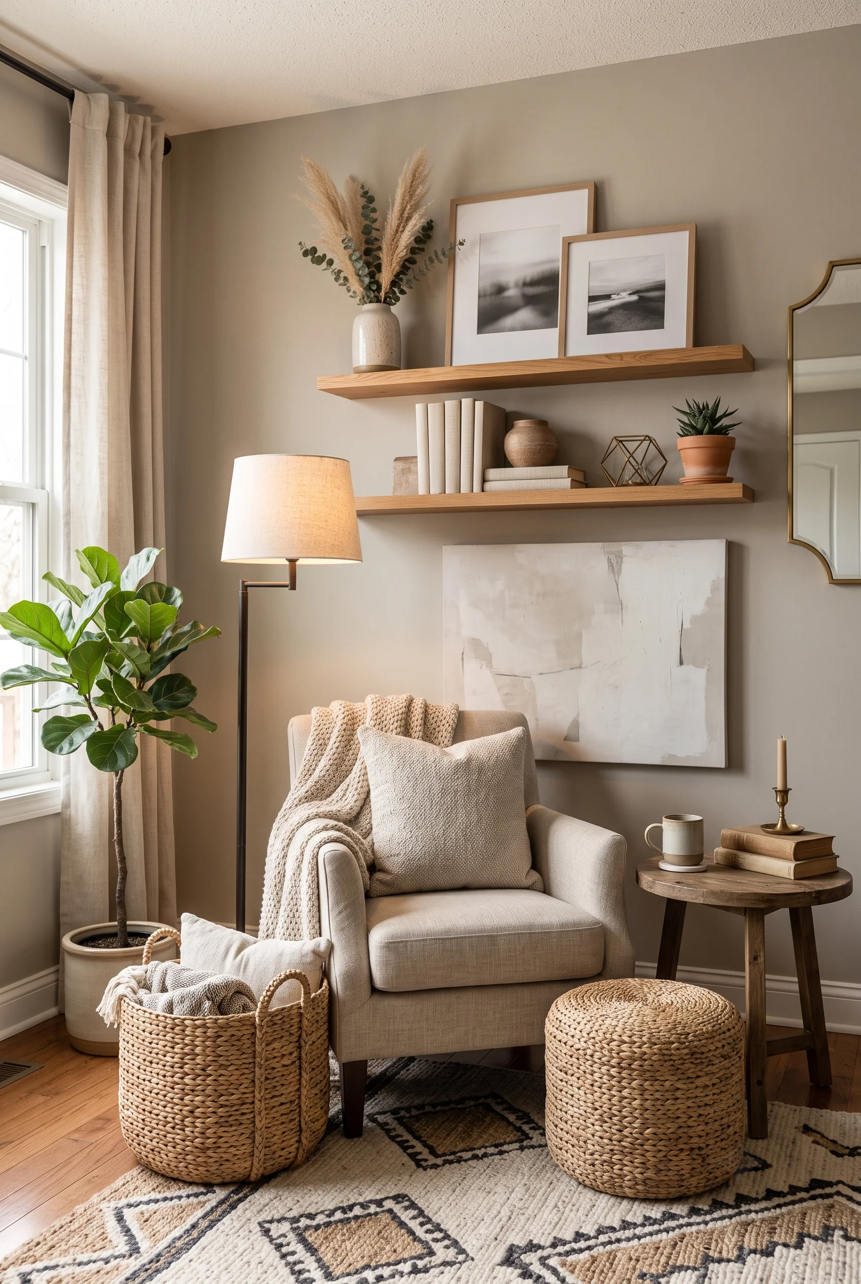
Black-and-white photographs, a small collection of books, and a scattering of ceramic objects fill these floating shelves, and none of it looks like it was purchased as a set. The shelves read like a life collected over time, not a display case styled in one afternoon.
A cream wingback chair below is draped in a soft throw, positioned so the shelves are the first thing anyone sees when they sit down.
Personal items like these are what separate a house that looks good in photos from one that actually feels like somebody’s home.
A Little Gold Keeps Neutral From Going Flat
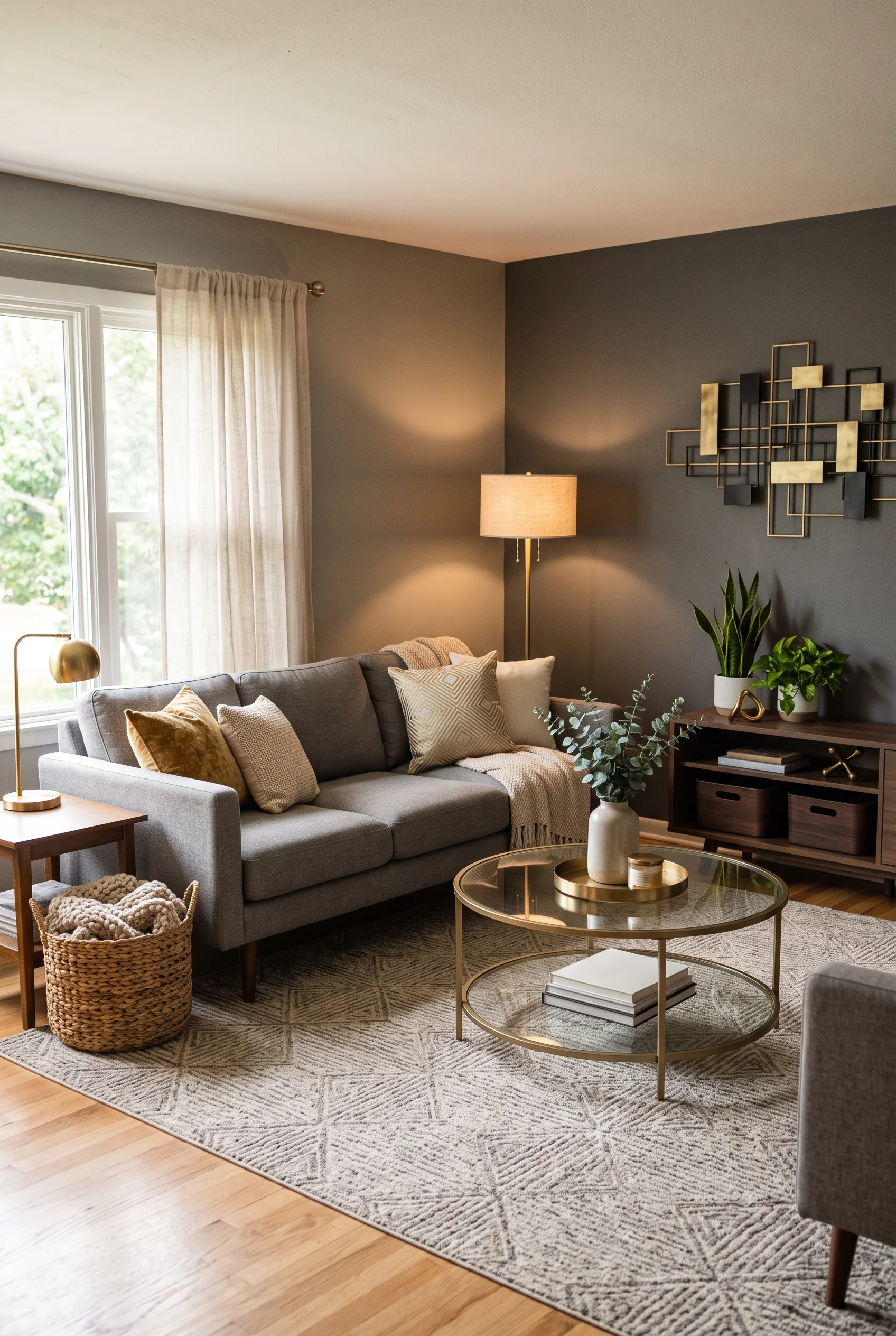
A geometric brass and black wall sculpture is the boldest thing in this otherwise deep, moody room, and it earns that role. Metallic accents like this catch light differently than fabric or wood, giving the eye somewhere new to land.
Brass lamps and a glass-and-brass coffee table repeat the same metal tone throughout the room, so the sculpture does not feel like a random addition.
Without it, the dark walls and gray sofa would risk feeling one-note. With it, the room has a clear focal point.
Scale Is the Whole Trick in This Dining Room
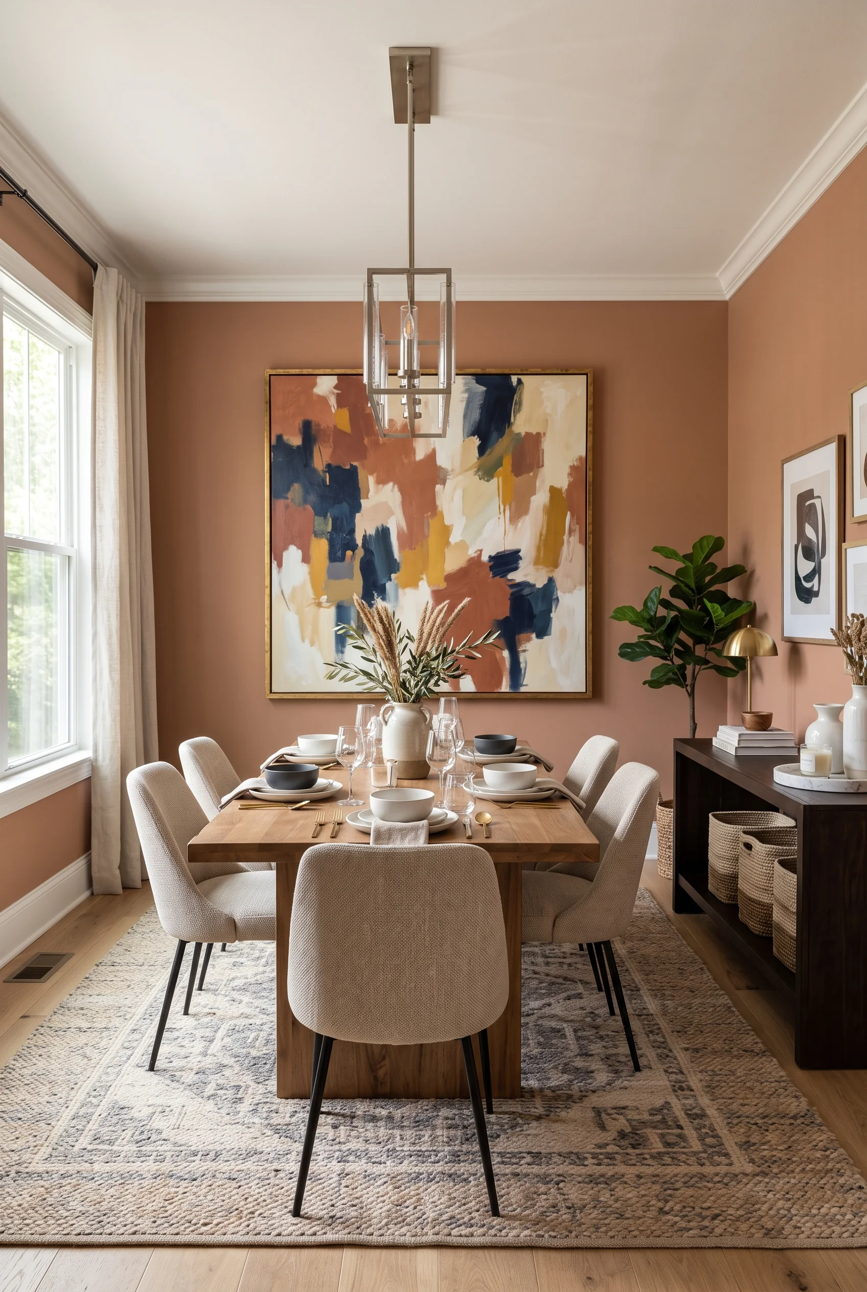
A single oversized abstract painting, in rust, navy, and mustard, takes up nearly the entire wall behind this dining table, and its scale is doing more than its color palette ever could on a smaller canvas.
Terracotta walls make an unexpected but effective backdrop, warmer than the typical neutral dining room, while cream upholstered chairs and a wood table keep the actual seating understated.
A painting this size does not need a matching color scheme elsewhere in the room. It just needs enough open wall to actually be seen.
A Bookshelf That Looks Lived In, Not Staged
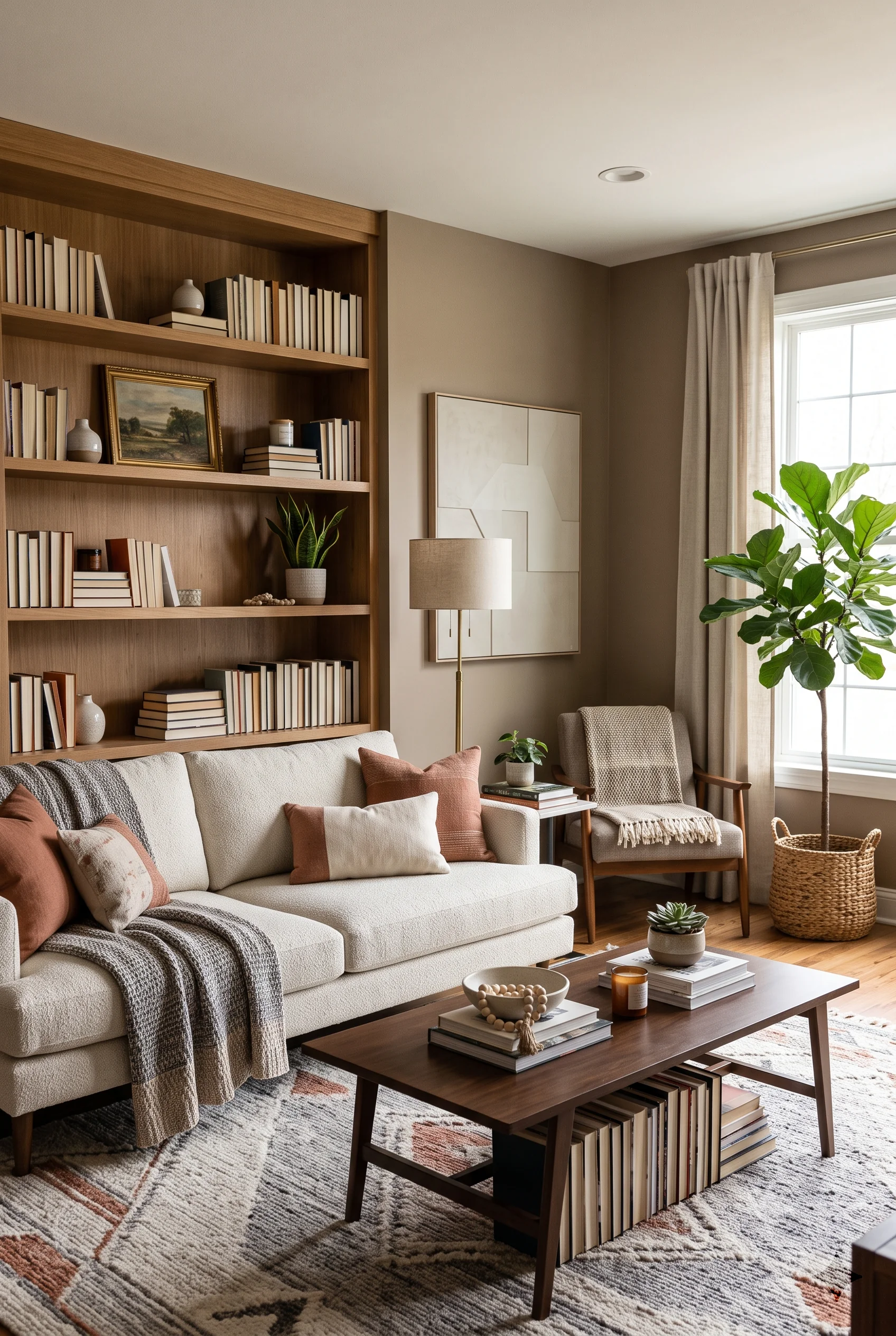
Every shelf here is packed edge to edge with books in every muted color, broken up only by a framed print, a strand of wood beads, and a couple of ceramic vases. Nothing is arranged with obvious symmetry.
That slightly imperfect fullness is what makes a bookshelf like this feel collected over years rather than styled in an afternoon.
A cream sofa with rust pillows sits close enough that the shelf becomes part of the seating area’s view, not just background furniture.
Personal Style, Spoken Quietly
The last four rooms are less about a single design trick and more about how personal taste shows up inside a restrained palette: through symmetry, through pieces that never chase trends, and through the way a big open room gets divided without walls. Even the photographs a family chooses to hang say something about who lives there. Neutral, it turns out, still has plenty of room for a point of view.
Paired Nightstands Settle the Whole Room
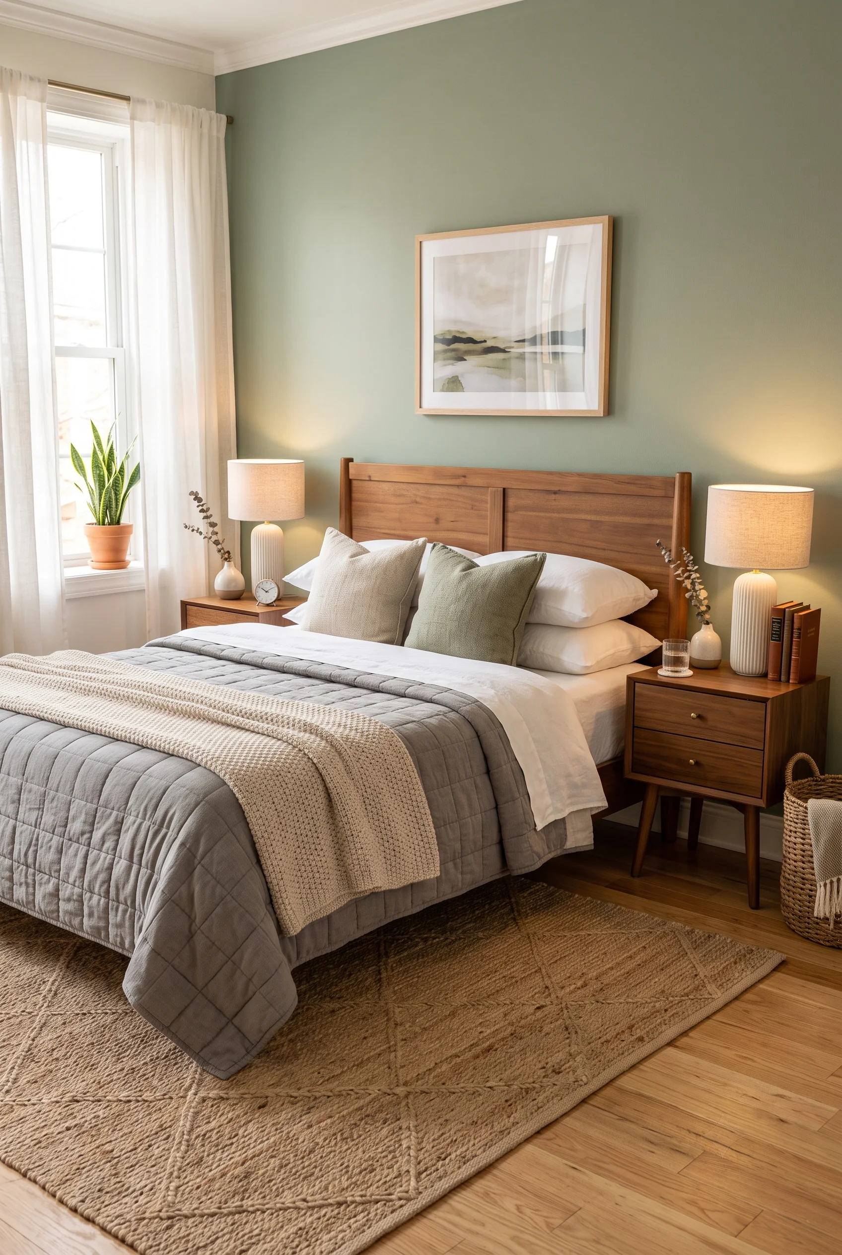
Two identical walnut nightstands, each with its own lamp, flank the bed here and instantly calm the whole room down. Symmetry does a lot of quiet work in a bedroom, more than most people give it credit for.
A sage green accent wall behind the walnut headboard is the only real color in the room, and the mirrored nightstand setup keeps that color from feeling like the only thing holding the palette together.
It is a small, easy change for anyone whose nightstands currently do not match at all.
A Chair That Skips Every Trend Cycle
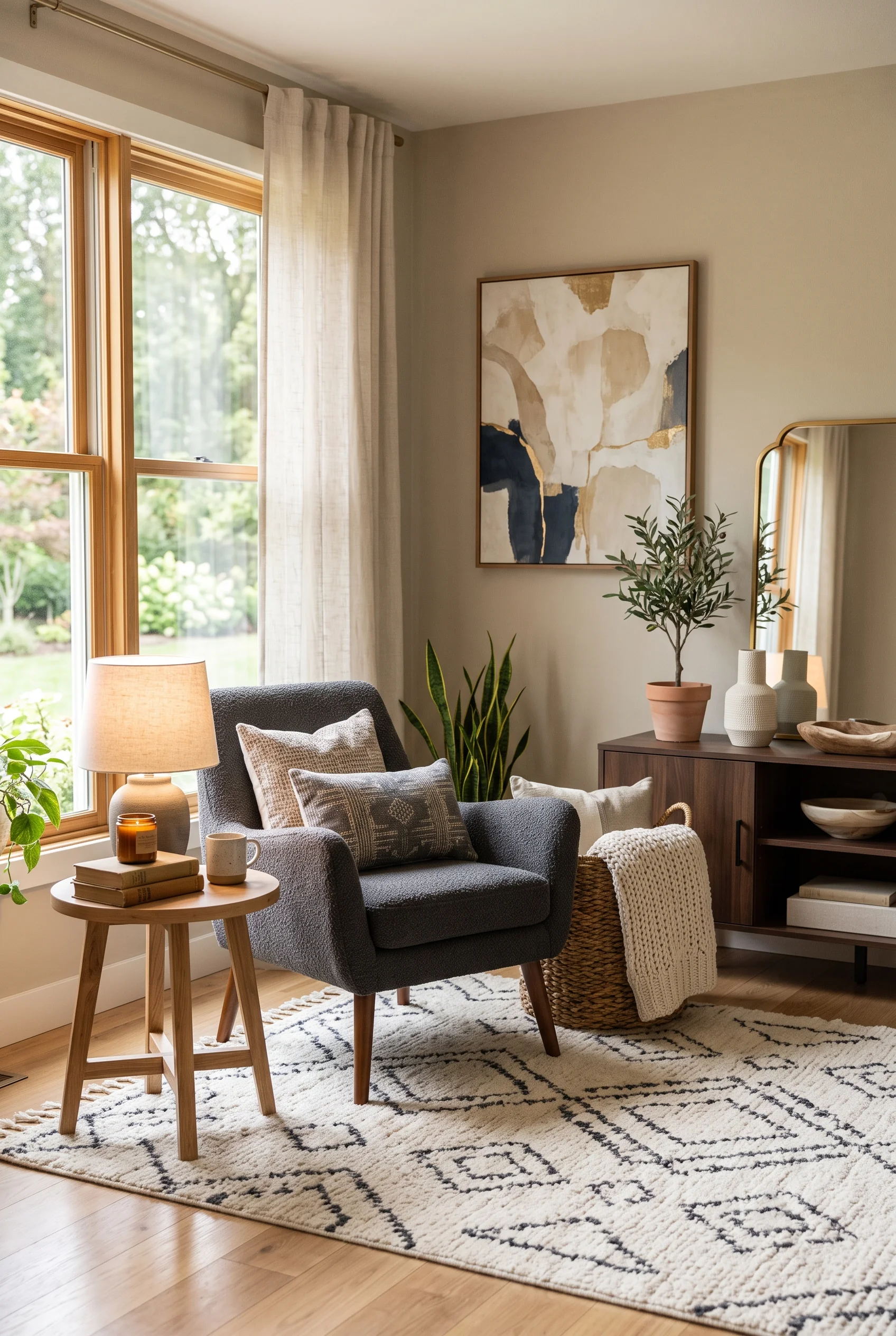
A simple charcoal armchair, the kind without a distinct era or trend attached to it, sits comfortably beside an olive tree and a walnut credenza. It will not look dated in five years, mostly because it does not look particularly of-the-moment right now either.
A gold-framed abstract painting and a matching arched mirror add just enough shine to keep the room from feeling plain, without pulling focus from the furniture itself.
Timeless, in a room like this, just means nothing was chosen because it was trending.
Two Rugs Quietly Split One Big Room

In an open floor plan, a jute rug under the dining table and a separate patterned rug under the sofa do the job walls used to do: they tell you where one room ends and another begins, without a single new structure.
Black wishbone chairs at the table and a gray sectional with mustard and rust pillows stay different enough from each other that each zone still feels distinct, even sharing one continuous floor.
It is a quiet solve for anyone whose living and dining space is really just one long room pretending to be two.
A Hallway Wall That Works Like a Photo Album
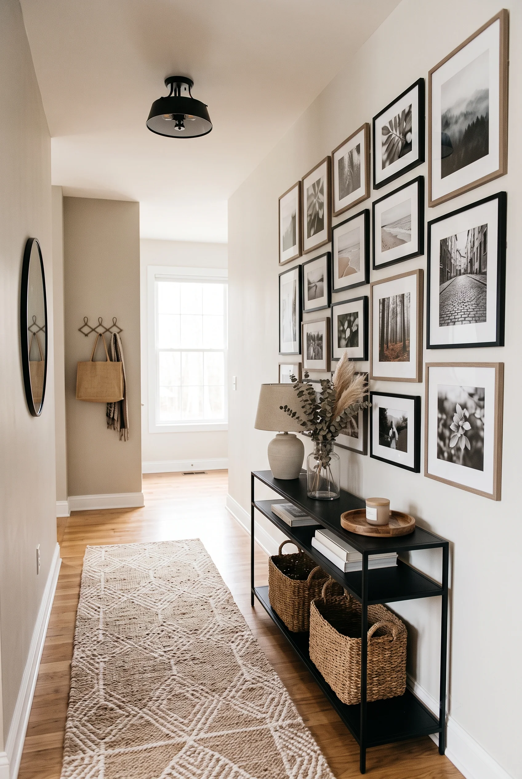
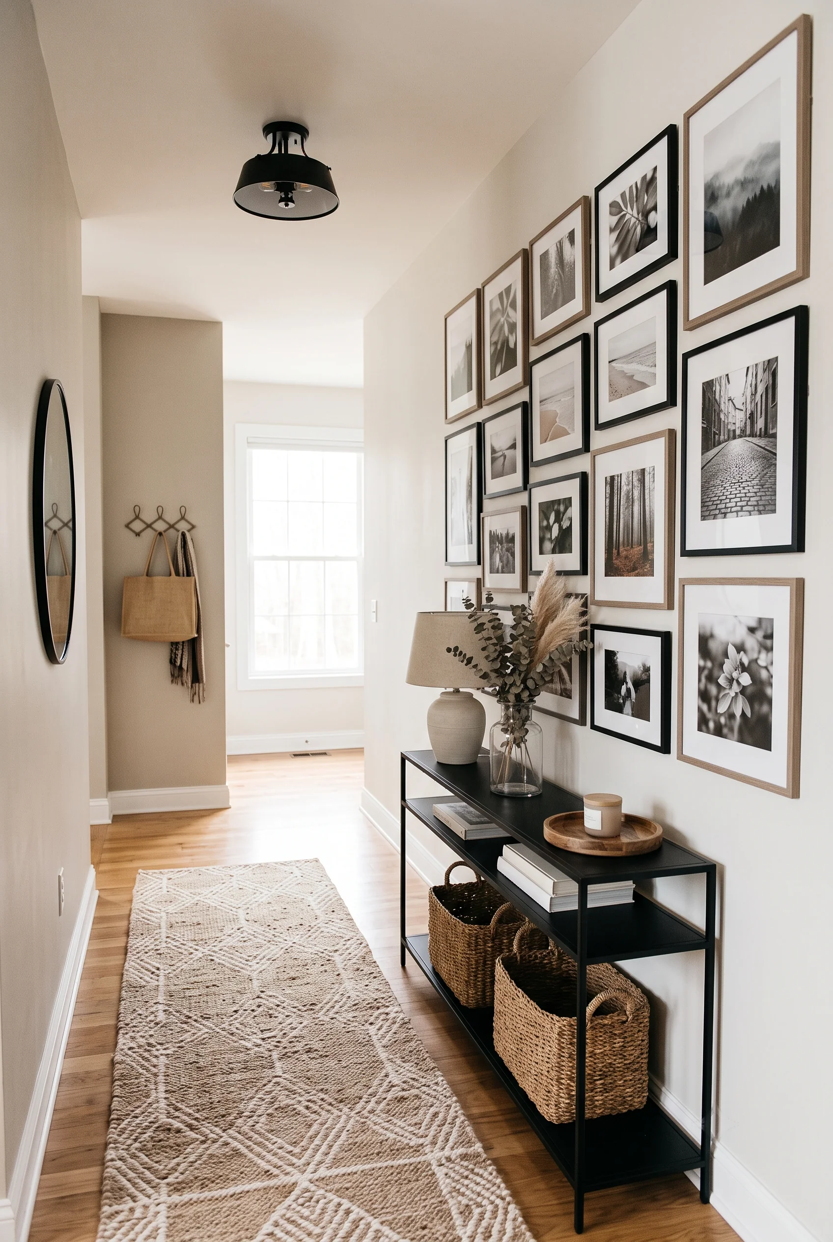
A dense gallery wall of black-and-white photographs, in a mix of wood and black frames, turns a plain hallway into the most personal spot in the house. No two frames match exactly, closer to a family archive than a showroom display.
A console table below holds a single lamp and a vase of eucalyptus, kept simple enough that the photographs stay the obvious focal point.
A hallway like this introduces the people who live there better than almost any other room in the house.
DISCLOSURE: Some of the links provided on this page are affiliate links. This means if you choose to make a purchase through these links, we may receive a small commission at no extra cost to you.
One Room First, Not All Thirty-Three
No one is meant to walk away from this list and redo an entire house in a weekend. Neutral home decor ideas work best taken one at a time: a new throw here, a mirror moved there, one bookshelf finally styled the way it always should have been. Start with whatever room bothers you most every time you walk past it, and pick two or three ideas from these that actually match how you live, not just how a photograph looks.
If your household runs on toy bins and half-finished art projects, functional storage and multi-purpose furniture will matter more than a perfectly styled bookshelf. If you spend more evenings reading than hosting, a single well-lit chair will do more for the room than a new sofa ever could. The rooms in this guide were chosen because they cover a wide range of budgets and effort levels, from a five-minute pillow swap to a full wallpaper install, precisely so there is an entry point regardless of where a room currently stands.
What ties all of it together is restraint, not the absence of style. Every room here still has color, pattern, and personality. It is just dialed down enough that the house feels calm to live in every day, not only on the days it gets cleaned for company.
Pick the one idea that solves your actual problem first. The rest of the house can catch up whenever it is ready.